Back in the days of British Rail, our rail network was shaped by one identity – albeit a well crafted, well thought out and well developed one – but still, just largely one identity. Throughout the 60s and 70s, rationalising design and standardising looks was the name of the game – and even though BR toyed with the idea of ‘branding’ in the 80s (Intercity, Regional Railways, Network South East) it was still all under the big, corporate, crafted government umbrella.
However, come the early 90s, and the passing of BR into the history books, a succession of private operators (from big global brands to little but powerful companies) have since painted our rail network in coats of many colours, but which ones have been the brightest and best? The nicest and most notable? The most controversial yet clever? In no particular order, here’s what I think are the 10 best rail liveries since privatisation took over the UK rail network…
Virgin Trains West Coast
Introduced 2001, still current on all West Coast fleet (except the door stripes!)
When introduced onto the Voyager and then Pendolino fleets, the Virgin Trains livery was a dash of modern, streamlined style in an industry seemingly obsessed with straight lines and block colours. The sculpted front end coupled with the clever use of mandatory warning yellow was, and still is, one of the best attempts at building the livery into the physical design of the train I’ve seen. You can easily see how the design guys got stuck in to the livery and look of the train at the same time as the engineering bods got cracking – most others tend to have a train first and figure out the livery second, a legacy from stock passing between BR and newer operators.
Virgin’s clever little details, such as the black surround on the windows seemingly combining all the windows into one, long strip (a neat visual trick often used by many other operators now), and the placing of a First Class ‘1’ roundel at window level, both add to the modern feeling of the design. The striped doors were a first too – Virgin believing they aided partially sighted people in locating the doors of the train on the platform – and were a key piece of the livery’s unique look. Since it’s now proven that solid block colour works better for those with visual impairments (and coupled to a door refresh programme), Virgin are stripping them away on Pendolinos to leave a solid colour grey door, which although looks different, actually helps to emphasise the cleanliness of the design.
With red seemingly flowing non-stop from end to end of the train, it too adds to the smooth, rounded, long feeling of the full set. Virgin also took a brave step not to splash their logo down every coach, it only being present on the driving ends, making the train feel ‘complete’ rather than a succession of carriages.
It makes my 10 best because it’s a livery that shows a rare trait… it’s really not aged. Given it’s nearly 20 years old, it still looks fresh and modern on the fleet today, and has become somewhat of a stereotypical symbol of the modern rail network (images of the Pendolino anchoring local news bulletins about ‘railways’ in areas not even served by Virgin, for example).
First Group’s Dynamic Lines
Introduced 2005, currently being phased out
First Group are not always the bastion of style and quality, but with their dynamic lines livery they got it right. Introduced first onto their First Great Western fleet, it was bold, modern and suitably different to anything else the industry had to offer. Plus, it firmly distanced their rail businesses from their often-ailing bus firm, purveying a classier, more refined style.
The block colour of the passenger doors worked with the livery to add a blast of bright magenta to the dark blue bodyside, and the solid one-colour power cars on HST sets gave a good base for the full FGW logo to show itself off (First added the dynamic lines livery to a few of their HST power cars originally but a major overhaul programme kicking off in late 2005 saw all power cars stripped down and repainted, which meant that solid colour became the future favoured option).
As the livery was steadily adopted across the FGW fleet, including their Class 180 Adelante trains (one of the nicest versions of the livery I think!) a nice little design adaptation was produced for their local services in the South West, with the dynamic lines themselves being made up of place names that the little local trains served. It was also successfully adapted onto the First Capital Connect fleet, where it appeared as the silhouette of a busy, bustling city. First Hull Trains and First Transpennine Express saw dynamic lines adopted too, using the same styling as First Great Western’s mainline ‘speed flow’ look – although let’s try not mention the ‘blow it up and see how awful it looks’ approach TPE took to their electric Class 350 units.
Still, a bold, bright and different approach to a classic train design style (straight lines down the bodyside) coupled with the fluidity and motion a good livery needs, means I’ve no qualms about putting this particular (First) group of liveries in my 10 best.
GNER (Great North Eastern Railway)
Introduced 1996, succeeded 2007.
A blast from the past, and sure, you might say ‘well it all looks a bit dull now’ but when you consider what the livery followed on from, and the market it was to serve, GNER nailed it.
GNER won their franchise in 1996, following on from the ‘design sensibleness’ of British Rail’s Intercity division on the East Coast Main Line. Drawing it’s style from a business-like formality, the GNER style of dark, bold blue, with a flash of red and gold lettering was so smart yet simple it looked like the business card of a top law firm. It felt First Class, it felt almost regal – and coupled with the cast metal badges, containing GNER’s own ‘crest’, in the centre of every passenger coach, along with claiming the trains to run on the ‘route of the Flying Scotsman’ – it pretty much was! It harked back to the glory, glamour days of the railway, mixing 1930’s semi-art-deco style with a new, modern look.
It makes my 10 best because, at the time, it was the perfect answer to creating a new ‘British Rail’ – moving the old national warhorse into a new era – but still paying respects to it’s past. When National Express came to replace it when they took the franchise in 2007, their new grey and white look was a positive let-down compared to the business-focused classic-yet-new style GNER had created. That being said, if it had stayed, by now the GNER look would have dated massively and I would have imagined a substantial redesign from them. ‘Harking back to the past’ shouldn’t be the standard for the modern rail network, but at the time, I think GNER got the public mood, and it’s potential new brand impact, just right.
Southern
Introduced 2004, still current on all Southern fleet
Currently mired in bad publicity and industrial strife, the Southern identity is not necessarily a good thing to be splashing around right now, but back in 2001, things were a little different. When Govia won the South Central franchise, taking it from the rather lacklustre Connex South Central, a new vision was needed. Connex had left the network with old trains, poor service and a disjointed and disappointing visual look. Sensibly, in late 2003, Govia looked to the heritage and history of the route, and used it to inspire its future.
The Southern name was introduced in 2004 and was taken from the famous pre-British Rail train company synonymous with the routes Govia’s trains were now running on, with the logo derived from the original identity too. A stretched serif writing out the ‘Southern’ name on a dark green plate with light green forming a London-like roundel.
Taking this on to the trains themselves, the application isn’t quite as subtle as the logo looks, but that’s no bad thing. Cleverly the end of each passenger coach is a coloured light green semi-circle punctured by a dark green band which runs the length and window height of the bodyside. So, on a whole train, it essentially makes it look like the logo is repeated, in large scale, down it’s entire length. The trick continues on driving ends too, so when two trains are coupled together, it still works.
It makes my 10 best because I think it’s one of those few liveries that has a genuine, recognised ‘brand value’. Yes, it’s just a simple yet effective, bold and bright treatment, but it was so successful and memorable that when the Southern network was swallowed by Govia’s new Thameslink Railway franchise, and they had a genuine chance to remove it and replace it with something new, they decided it had enough positive feeling and customer recognition (‘brand value’) to warrant staying. Good on them I say. Let’s just hope it’s current problems don’t cancel out the value it once had.
Stagecoach Rail (South West Trains / East Midlands Trains)
Introduced 2000 (SWT), 2007 (EMT), still current on both fleets
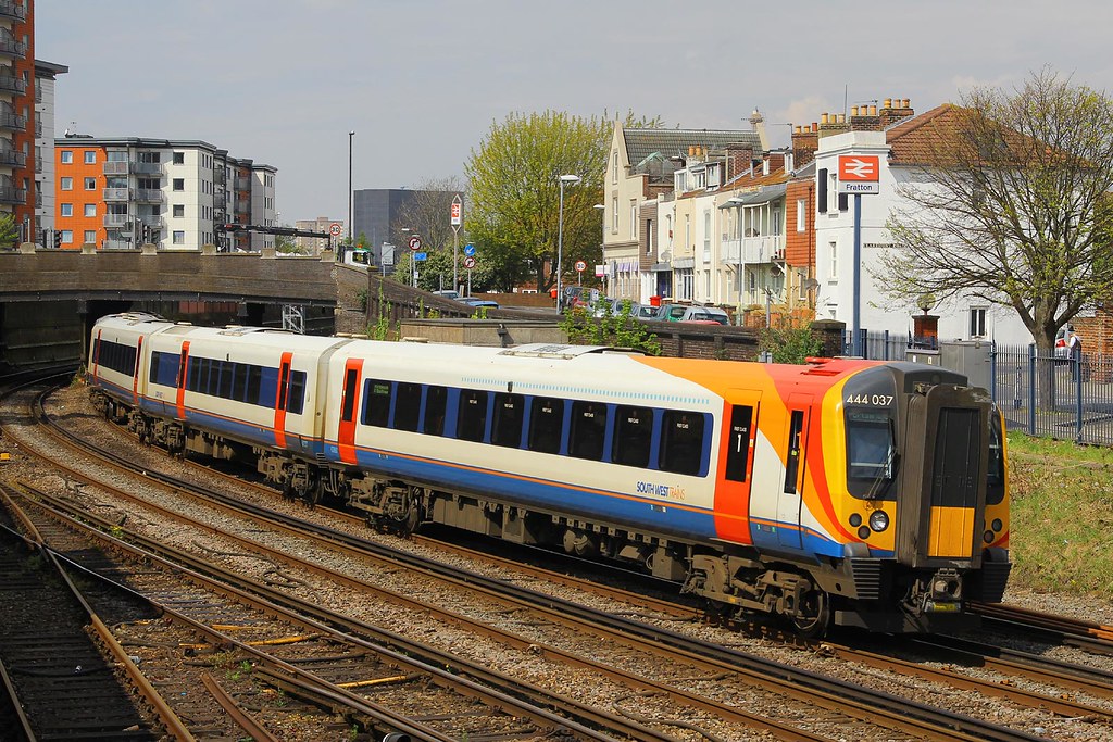
Stagecoach Group, probably best known for its exploits in the bus world, has a large presence on our UK rail network. From privatisation in 1996, it has run South West Trains and had a partnership with Virgin in its West Coast (and formerly CrossCountry) operations too. It added East Midlands Trains (taking over from National Express’s Midland Mainline) in 2007 and finally partnered with Virgin again to take over East Coast in 2015.
Livery has always been a strong point for Stagecoach… originally (and rather cleverly) for it’s South West Trains fleet, upon inheriting stock from BR’s Network South East, Stagecoach simply added an orange stripe to the blue, red and white livery, and it paid a passing resemblance to their bus fleet. Perfect.
But with new franchises comes the promise of new and refurbished rolling stock, and as the new trains approached service, and a new millennium arrived, it was generally felt the image of Stagecoach was rather old and dated. So, in 2000, everything from the logo and typeface, down to the buses and trains themselves, was redesigned and restyled, including a brand new look and livery for South West Trains. The inspiration for the livery draws heavily from the circular curves of the Stagecoach logo itself, with two smooth waves of colour leading from the lower nose to cover most of the front of the set. It’s a neat technique to make a very square train, look less so – a smoother, cleaner looking livery, giving the impression of speed and modernity. Three versions of the swooping livery exist on the SWT network, white, red and blue, mainly to separate which type of stock runs which type of service. Although of late it’s not such a clear divide between the three, the different colours still offering a nice bit of variation at a crowded Waterloo station.
Stagecoach took over the Midland Main Line franchise in 2007, renaming the services East Midlands Trains, in the same vein as their SWT business. With this franchise came longer distance routes and HST and Class 222 Meridian trains. These presented a chance for the application of the Stagecoach master livery in new, even more stylised ways, with the pointed end of the HST and the gentle curves of the Meridian providing a perfect canvas for long, trailing swoops and flashes of colour. Smaller, boxier Sprinter units received the same livery as their SWT counterparts.
It makes my 10 best because I feel the Stagecoach rail look has become quite timeless. Its unique swooped style still looks modern 14 years later, and the clever use of the three main Stagecoach branding colours in so many different ways should be admired. With Stagecoach still interested in new franchises, we could yet see the red, orange and blue applied in new and different places yet!
Midland Mainline
Introduced 1996, succeeded 2004.
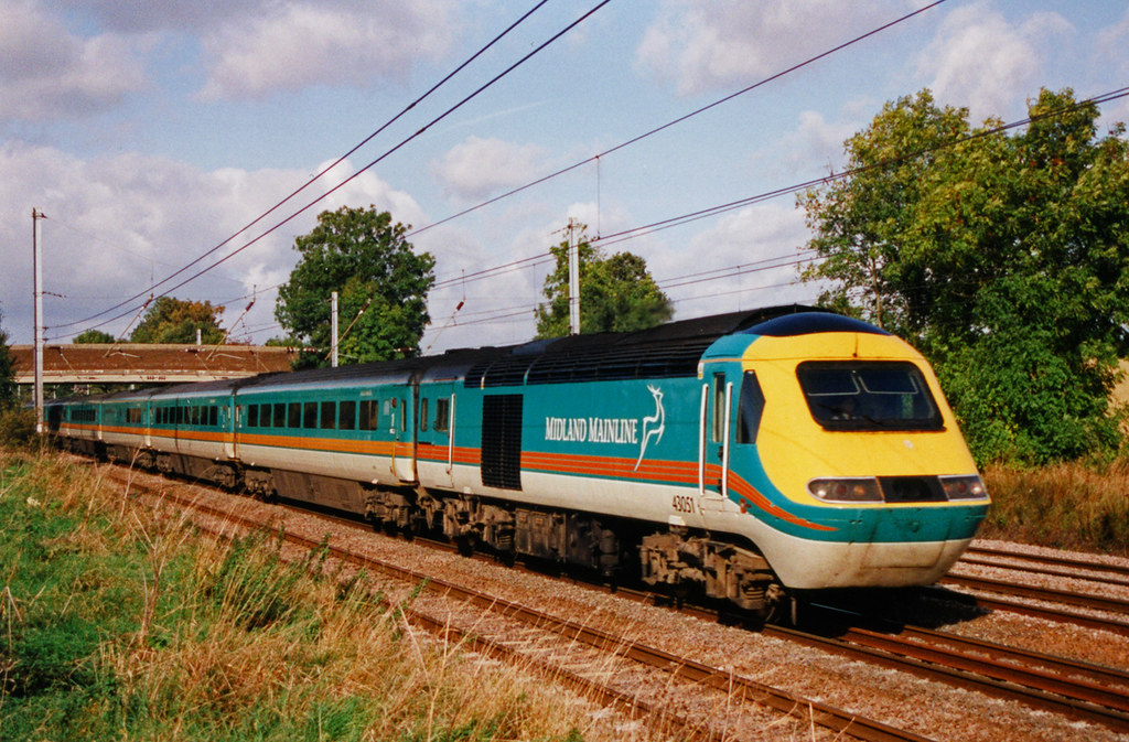
National Express, the nation’s best known long distance coach company (and a popular song by the band “The Divine Comedy”… come on, you know it!), has a long history of rail franchising ventures – the collapse of their East Coast business in 2009 pushed them largely to only the current C2C franchise, but back in the late 90s, they were a force to be reckoned with in rail. Having won the Midland Main Line franchise in 1996, they set about the same job as all other operators at the time, creating a new look that set their trains apart from the competitors, and from British Rail before it.
A bold choice was made, the colours of cream, teal and tangerine selected and a new vision born. Taking a bit of a lead from BR’s last ‘executive’ livery, with it’s dark upper body and whiter lower body, Midland Mainline applied a vivid teal to the top half of the trains, cream to the bottom and some clean, simple and bold tangerine stripes parting the two. Colour-wise, it was very different to what it had preceded, but this was no bad thing. A new vision needs a new look, and being bold was very much the flavour of the day come privatisation. Midland Mainline bucked the trend of reds, blacks, blue and white and went to town with something people would really notice.
At the time there were no restrictions around train doors needed to be a different colour to the bodyside, so the teal/cream combination continued down the length of the train until it, on the HST, reached the pointed driving end, and swooped down and round the nose. Mandatory warning yellow added in a large circle around the drivers windows to make the train look wider and rounder was a good visual trick later used by Stagecoach on it’s EMT sets too (although them coming from the same designer is probably the reason for that!).
In 2004, the teal and tangerine was washed over with boring shades of blue, white and black and boredom reigned again over the franchise.
This definitely makes my 10 best for it’s daring design in the face of corporate boredom – National Express could have played it safe and kept the same mundane styles as we’d seen in the latter days of BR (see Chiltern Railways or the original Great Western liveries for examples of that!), but they decided to make a splash – a bright, proud, colourful splash at that – and led the way in proving customers don’t just want boring uniformity on their trains. Daring design always draws opinions, mixed opinions at that, and to me, turning train design into a talking point, after all those years of it ‘blink and you’ll miss it’ style, means it was a job well done.
Glasgow’s Subway
Introduced 2011, still current on all fleet
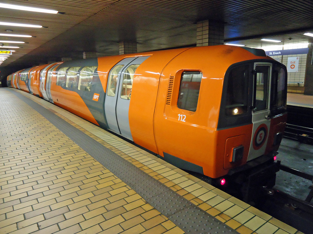
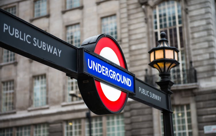
Firstly, shocking news to some… Glasgow has a fully-fledged (albeit small) ‘underground’ system named Subway (nope, nothing to do with the shop selling large sandwiches). Secondly, just as shocking, it’s better looking than any London Underground train could ever muster. And thirdly, a little lie… the Subway has always been operated by SPT (Strathclyde Partnership for Transport) and it’s predecessors, and so never really privatised, but I loved this one so much, I had to include it.
Opening way back in 1896, Glasgow’s Subway is actually the third oldest in the world, behind London and Budapest. A 6.5 mile loop is all it operates (to compare, London’s is 250 miles in total), but it links key rail stations and locations around the city, providing an alternative to less desirable, more expensive and slower bus and taxi journeys.
The current fleet was ordered in 1977, began service in 1980 and is unique to the Subway – originally carrying dark orange ‘Strathcylde Red’ all over, in 2006 SPT’s red and carmine colour scheme was adopted, which frankly was an exercise in retro nonsense. Also added to much of SPT’s above ground trains, it made everything look dated and was an obvious throwback to the steam era… which, as you might have guessed, visually just doesn’t work on modern trains!
In 2011, SPT saw sense and set about repainting the trains (alongside a programme of modernisation) back into a new ‘Strathclyde Red’ (orange) livery. A new stylised ‘S’ symbol and font was introduced across the trains, stations and signage (think like a TFL roundel and style, but for Glasgow), and flashes of white and grey were added to the new livery to create look that I think, almost has a hint of ‘orange urban camouflage’ about it! Light grey doors and highlights finish off a bold, bright, unique train, styled like no-other subway before it.
Glasgow’s Subway makes my 10 best simply because it’s so different. SPT wanted to create a stylised, clean look that gave the Subway it’s own identity and kept it up with the modern city Glasgow has become. They realised if you paint and brand an old system like it’s old, people will think just that. Create an identity, give it a unique look and celebrate its difference, and you’ve got a recipe for transport greatness.
Eurostar’s E320
Introduced 2014, currently being rolled out across Eurostar’s fleet
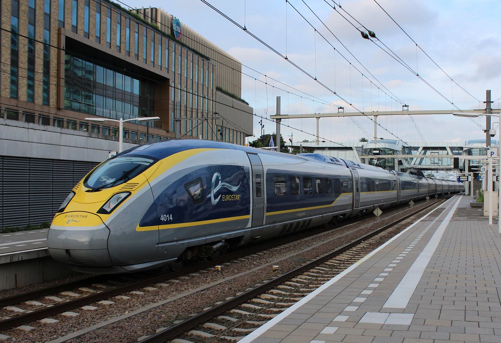
With the great role of operating express passenger services through the Channel Tunnel to France and beyond, comes great responsibility. And when you consider the British view of Paris is that of a cosmopolitan, highly styled and art-loving destination, good design is suddenly a key part of what you need to make your trans-continental service a hit.
From its birth, Eurostar has tried to bring a mix of Gallic flare and British sensibility to its design approach. When services began back in 1994, the new, extremely long and super-fast Class 373 trains were given a clean, cool look; mixing mid grey with white and a vibrant splash of yellow, both inside and out. In 2004, to celebrate 10 years, Eurostar bought in famed designer Philippe Starck to restyle its interiors, bringing a subtler grey-red look to First and a grey-brown look to Standard.
In 2008, to coincide with the half-life of the 373 fleet, and alongside an announcement of a brand new fleet of Siemens Velaro trains (named Class 374 or E320 and allowing for services to more European destinations, such as Amsterdam, to be considered) Eurostar announced they would commission famed Italian design house Pininfarina to completely redesign and restyle the trains both inside and out.
As we approached 2010, the public finally got its chance to see their efforts. The new livery wasn’t a ‘throw it away and start again’ job, but more of a detailed reinvention and modernisation of the Eurostar look. Coupled with a new logo, new fonts and general new branding throughout, the Eurostar livery left its predominant white and yellow roots, this time adding in large swoops of dark blue, on mix of light and dark grey background.
Starting at the nose, the blue follows the contours and shape of the trains, gently rising at the end of the driving car to continue the full length of every passenger coach at window level. A light grey foundation sits under the blue, with dark grey towards the bottom of the coach, and a neat, simple yellow key line running the full length of the train. As the French would say, c’est manifique!
Eurostar’s new livery makes my 10 best because it a great example of how to revise and reinvent a livery, without throwing away the roots of what made it great. Eurostar recognised that new trains, major refurbishments and new destinations were going to be a key catalyst for growth in its business, but knew they already had a business and brand customers liked – so by asking for help from the Italians to restyle French and German built trains which operate from a major British rail terminal, and concentrating on design evolution, rather than revolution, they’ve created a new standard for European trans-continental rail design.
London Midland
Introduced 2007, still current on all London Midland fleet
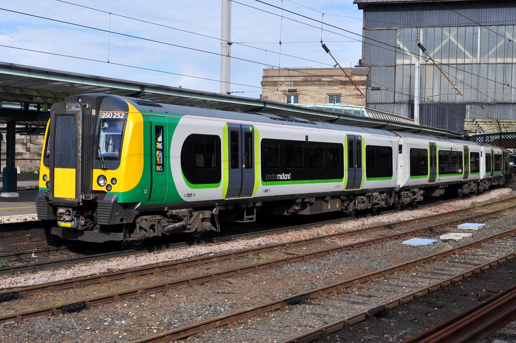
If there’s one word that made me shudder as a student of railway branding, it was ‘Silverlink’. Silverlink operated what is now the core of London Midland’s franchise pre-2007 and really I understood, at the time, why the purples and greens were selected (goes back to the post-privatisation want for visual impact again) but to be honest, it just never quite worked for me. The fairly straight main sections of livery with hill-like kink at the end and odd bird logo just never quite made me feel that it did anything to compliment or improve the boxy looks of the Silverlink fleet – it just didn’t work in quite the same way as Midland Mainline had achieved with their daring look.
However, all was not lost. Roll on 2007 and with Govia winning a new franchise combining the Silverlink and Central Trains fleets (and a whole load of new Class 350 Desiros being introduced) a new look was needed. Something that spoke of the future of the franchise, and left behind Silverlink’s slightly wobbly design past.
The new livery, with its long straight shapes with curved and rounded edges, mixing green, black and grey, perfectly fitted the Class 350 trains (which are, as expected, long and slightly curved). It felt clean and modern, it felt like it spoke of a proper commuter railway, serious about it’s business, but thanks to use lower case lettering and a softer tone of voice, slightly more approachable too.
The cleanliness of the livery allowed for continuous flow along full 12 car sets (as Class 350s often run) and the simplicity of the style has allowed it to be applied to many different boxy-yet-slightly-rounded trains including Classes 150, 153, 170, 172, 319, 321 and 323.
In fact, such a thorough job was done with Govia’s London Midland branding, all stations on the route got new colours, signage and more, cleverly displayed as predominately white lettering on black with hints of green, a reverse from that of the train fleet, so they didn’t clash or disappear when they arrived in the station. Nicely done.
London Midland’s livery makes my 10 best because it shows two things. Firstly, how creating a new look, properly integrated across all trains and stations, can bring new life to a franchise and put a new sense of direction and importance (while yet still being approachable) on the job that franchise does, particularly if, like London Midland, it’s a commuter heavy railway. Secondly, that a good livery should be adaptable across multiple stock while still looking uniform, and help to lend a sense of modernity to older styled trains, of which Britain is still unfortunately full of. London Midland’s livery achieves both of these things in spades. Good job Govia.
GWR (Great Western Railway)
Introduced 2015, currently being rolled out across all GWR fleet
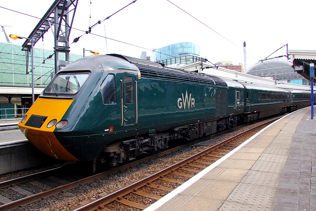
My final choice for my 10 best is a controversial one. Since we’re now 20 years after privatisation first arrived, I hate the idea of the UK rail network harking back to its past, particularly holding on to its over-romanticised days-of-steam rose-tinted views of how great things were and how much better the network ran. I very much come from a school of looking to the future, and showing how rail can lead a reinvention of public transport, offering viable alternatives to the car, the coach and the plane… but… I still have a soft spot now and again for something retro that feel like it just works, and GWR’s new livery has got me there.
It’s no news to anyone that the First Great Western brand had a bit of an image problem. Despite their nice dynamic lines livery, their trains weren’t the most cared for, their staff weren’t the best trained and their services weren’t the most on-time. Customers had even nicknamed them ‘Worst Late Western’. So, it seemed like, with the promise of new trains, new electrified lines, and First Group re-winning key franchises on other routes, a reinvention was needed. And First Group did what I hate, looked straight back into the history books.
The ‘Great Western Railway’ name and identity was revealed in September 2015, with the promise it had been driven by ‘what the customer wanted’ – a return to the classic values of an ‘old railway’ but with a modern twist. Personally, I’m not so sure. First wanted to play on that ‘rose-tinted’ aspect people often have of the rail network, and banish their old image with a revival of an even older one. The thing is if you cover up a wall in urgent need of repair with fancy wallpaper, at some point, that wall will fall down regardless. But I digress, the livery…
Now, to look at, the new GWR livery doesn’t do much. It’s green. Great Western green to be precise. What it does do however is concentrate on the details, and that’s what I like. On the HST power cars, the GWR logo is applied with in cut aluminium stand-off lettering, and the vehicle number is towards the rear, leaving the front clean, clear and uncluttered. Great stuff. The carriages (and electric and diesel stock) may just have a simple light grey keyline along their side but they also have a distinctly unique strip of matt-effect paint running down from top to bottom, slightly angled and containing the GWR logo. It’s a really subtle effect but to be honest, it looks great and shifts the livery upmarket. It taps into that GNER sense of ‘regality’ of design, doing something that feels ‘quality’ even if it’s just an effect on the side of a train.
The GWR livery sits proudly on my 10 best because I feel it’s a bit brave to step into the past to look to a new future (from First’s point of view) and it’s extremely well researched and cleverly thought out (from a designer’s point of view). First haven’t minced their words or efforts with this. I love the detail-focused approach and letting the Great Western green have the visual impact it deserves. This identity is a proper out with the old, and in with the… well… older. Admittedly that might sound odd, but coupled to their new look GWR have rolled out loud advertising claiming a ‘new railway’, a ‘return to Brunel’s great network’ and ‘a railway that belongs to the region it serves’. Now, with a greener, greater looking fleet and the arrival of new Class 800/801 trains, First have to make sure GWR stands up to those bold claims, or all the nice paint jobs in world won’t stop GWR heading off down the track to Worst Late Western.
Liveries I’ve missed…
I’m sure there’s lots of liveries out there you would consider worthy of your own 10 best, and there a few choice ones I left out of my own 10 too…
The new Virgin Trains East Coast one for example is a symphony of red and pearl coloured swoops and curves that almost give a ‘sexy’ vibe to the rather square Class 91 & Mk4 coaches (yes, I did say sexy, and more on that livery and its development in an upcoming post I’m writing!), the current Scotrail livery with it’s dotted saltire joining coaches together (although there are still a few too many dots elsewhere on the bodyside), the ‘Highland green’ and stag antler motifs of the new Caledonian Sleeper livery and I have a real soft spot for Grand Central’s deep black with vivid orange stripe, particularly on their Class 180 trains (it looks a bit hopeless on the HSTs!)
So, hopefully this article has awoken your “yes, I agree, but what about this livery which is much better” senses, so let me know what you think… what’s your best of the best on rails?
Write in the comments below, or tweet us: @transportdsn and @samthebox.