For those of us involved in public transport design across the UK, we can often look towards North America with bit of disappointment.
If you’ve experienced both the US and Canada’s often-late largely-blank regional train services and distinctly-lacklustre, fairly-monotonous inter-city bus services, you will know that information isn’t usually easy to find or clearly displayed, branding is seen as a second thought and they all seem obsessed with the word ‘transit’ – which in the UK conjures up thoughts of large volume movement from A to B, rather than excellent customer service from a well-designed, well-presented transport provider.
Now, there are those out there that believe that public transport actually just has that one sole purpose. A to B. Nothing more. But I’m guessing (and hoping) that you, valued reader of TransportDesigned, don’t subscribe to this particular notion, so I feel safe to continue in my triumphing of great design working hand-in-hand with great service to create a great public transport brand.
And that’s where GO Transit comes in. Last year, my end-of-summer holiday to the US and Canada saw me take in Seattle, Vancouver and Toronto over the course of two weeks, all the while experiencing local and national public transport on both the roads and rails to take you to the many beautiful national parks in Canada to choose from.
To summarise, it was all largely forgettable. Where some operators made a modicum of effort, most missed the mark completely with an odd mix of graphical styles, uninspiring liveries and interiors, poor information graphics and confusing signage, and a somewhat brazen ‘just A to B’ attitude. I don’t want to tar all operators with the same brush, and from what I’ve seen some are getting their design act together and understand the value of creating a distinct, unique, consistent and coherent identity, but many are still lagging behind.
GO however, were the design heroes of my trip. A lean, green, well-branded, well-operated, public transport machine. They are, in my view, fairly unique in North American public transport operators in that while they think in a very joined up way (connections between train and bus are easy and timely) and customer service is done mostly with a smile (in a continent known for ‘service with a smile’ it was amazing to see how many public transport operators obviously missed that particular memo), they also have (and most importantly in my view) a brand with a bold, distinct style which is coherently and consistently applied across all touchpoints.
And while other operators are just discovering the value of this approach, for GO Transit, none of this is new.
Unlike many North American public transport operators, the GO brand has a history, a design style legacy that has, very much like Transport for London (TfL) has done in our capital, weaved itself into the fabric of Toronto’s culture and identity.
GO carries millions of Torontonians every year, and its logo and design are spread far and wide across the city. But to most travellers, its largely ignored. It is just part of their daily lives. But that’s no bad thing. Think of it like this… the TfL roundel has become synonymous with transport across our capital to the point where it’s a symbol people just ‘expect’ to see on a daily basis, part of the graphical fabric of a well-connected, well-supported urban environment, and in Toronto, GO has nailed exactly the same.
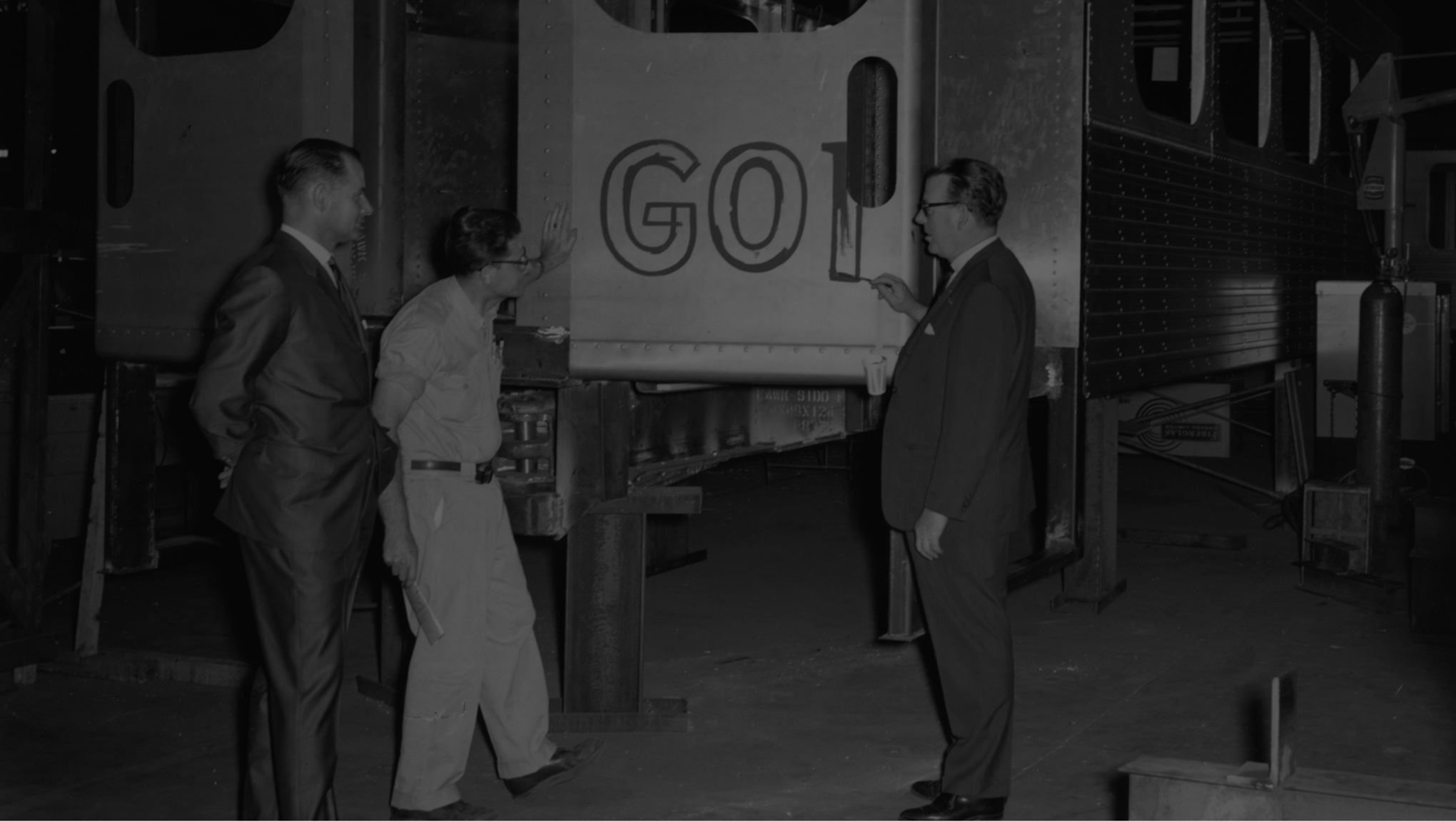
The GO brand began back in the late 1960s. McConnell Eastman, the advertising agency of the time for CN (Canadian National – one of Canada’s main rail operators) were awarded the contract to produce a brand for the Ontario government and the new transit system for the city of Toronto. They’d formed a good working relationship with Montreal-based design agency Gagnon-Valkus, who had designed CN’s hugely-well-received logo and identity back in 1961 (with the help of renowned Canadian graphic designer Allan Fleming), and so contracted them to help bring some design-led thinking to the rather large transit mountain ahead of them.
Gagnon-Valkus were known for a largely collaborative approach in their studio and so set the task to their full design team to come up for an icon, a form, something unique to give this new transit entity something to hang its brand on.
In the book “Building GO Transit: The Rail Commuter Initiative of the Government of Ontario & Canadian National Railways, people in the project 1965-1969”, a senior member of Gagnon-Valkus’ design team, Frank Fox, remembers how the project came to a surprisingly quick resolution. “They wanted to bring the initials of the Government of Ontario, into a unified logo, so I started working on it conceptually right away. We started thumbnail sketches and in one of those surprising things that happens every now and again, the actual concept of the GO symbol came up very quickly. We were thinking of two circles with a letter “T” somewhere in them. We had cut out two circles, then literally put a square into the circle, then “Bingo”, there was the G, in green, and we could lay a white “T” on it.”
“Sometimes that happens in design, a happy accident. More or less, we had this feeling among us that this couldn’t be true. We went off trying many other solutions, but nothing else was good enough. I know we were surprised, this thing happened rather quickly. We played with the proportions a bit, because we did not want the overlying “T” to disappear, when the logo would be reduced in size.”
[youtube https://www.youtube.com/watch?v=kbp9nWbGxEE&w=560&h=315]
Soon after the final draft was complete, the Gagnon-Valkus team headed back to McConnell Eastman to pitch their new concept along with examples of its various applications. It was approved at first sight. Frank and his team’s role diminished after this as McConnell Eastman began the design development and roll out, but it’s good to still hat-tip to those at Gagnon-Valkus who add a little bit of their own genius to create something special, something timeless, even if, in their own words, it feels more like a ‘happy accident’ that a proper hard-thought idea!
The original ‘GO’ logo is still largely unchanged (‘cept for a bit of spacing and a recent colour tweak, more on that later) and it really doesn’t show its age. Good design stands the test of time. Look at the famed logos of Apple, Disney, Ford, Coca-Cola, McDonalds, Toyota – yes, all have been tweaked over time but not to the point where they have been reinvented. And why should they, when you’ve got emotion, value and trust tied up in a logo and an identity? To change it is to show weakness or a problem that needs to be rectified – to stay strong and evolve shows belief in your core values and a confidence in the message you communicate and the product you offer.
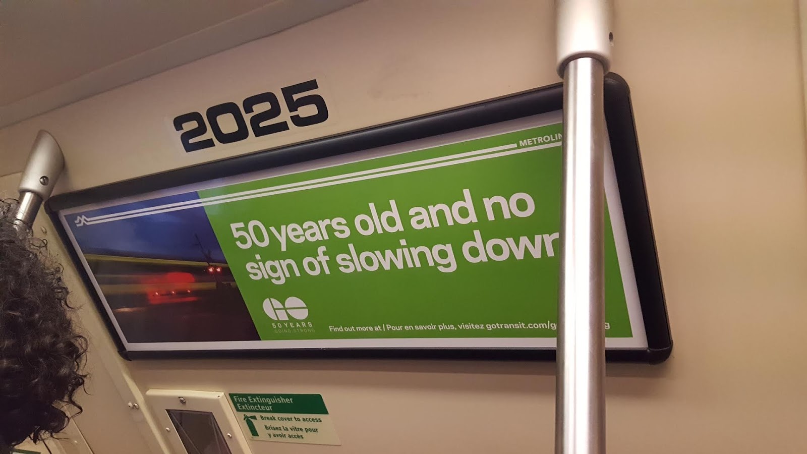
Anyway, onto my thoughts on the actual GO brand and its associated design, and some of the highlights I noted during my time travelling with them. First, it’s good to note that GO’s identity is currently undergoing its biggest revamp since its launch 50 years ago, so now’s a great time to look at what makes its identity tick. Let’s look at both their ‘classic’ identity and in turn their new, slightly different ‘revamp’ – you decide which you like best!
Interestingly, if you want to know more about GO’s first 50 years, they’ve put together a great website timeline here
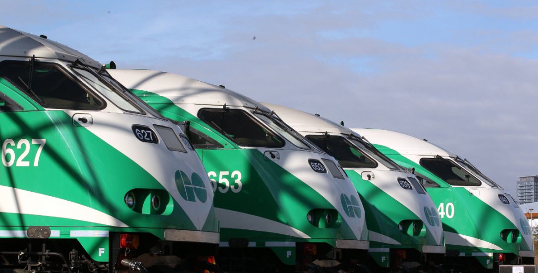
The ‘classic’ GO livery sees a single shade of green (funnily enough exactly the same shade of green as all highway signs across Ontario), over a white background, forming two stripes along the length of the body-side of the vehicle. Back the days when GO were using squarer GP40, F40 or F59 locomotives, the two stripes would strike off at a 45-degree angle towards the nose of the loco, however when in 2008 GO introduced the rounded, more ‘express-train’ like MP40PH, the two stripes curved off gently towards the lower nose. Whatever the angles or swoops, it was always a single shade of green, in an upper and a lower stripe, white in the centre, taking essentially the form of a ‘blown-up’ cut from the GO logo.
GO’s fleet of buses followed the same look, with their original GMDD fleet using the 45-degree angle effect livery from the GP40 locos, and later MCI buses using the curved swoops from the MP40PH. Overall, a bold, simple, effective livery – just what a reliable, trusted transport provider needs. It was unfussy, almost utilitarian, but again, let’s look at the liveries in use across TfL in London (tube, overground, tram, bus) and you can see, it’s no bad thing. Sometimes simple, smart and effective is what blends a brand into the background of a city, and turns it into an icon, rather than a participant in a brand shouting contest!
So, to Tuesday 16 July 2013, a momentous day for GO Transit, a day where everything changes. Well I say everything, but in the world of the single-coloured, neat-and-clean, simple-and-straightforward GO Transit, it was a pretty revolutionary day. On this sunny Tuesday morning GO rolled out one of their MP40PH locos in a new livery with… wait for it… two shades of green! As much as I joke, GO had their reasons for wanting to bring their livery into the 21st century.
Firstly, they had tweaked their logo for digital use (on screen, apps, that sort of thing) increasing the gaps between the ‘G’ and ‘O’ and also the ‘T’ cut-through, meaning even when shrunk down small, the logo stayed clear and legible. A sensible change.
Secondly, a new crown agency ‘Metrolinx’ had been created back in 2006 by the Ontario government to manage public transport across the whole province. GO Transit became one of the key assets of Metrolinx, alongside the transit in the cities of Hamilton and Ottawa, and they announced ambitious plans for the GO network.
From 20 new bi-level passenger cars to strengthen rail services, a fleet of new buses to help expand GO’s road network, the implementation of the Presto card – a reloadable pay-as-you-go travel card (similar to TfL’s Oyster system), a new link from Toronto’s Union Station to Pearson Airport (now called the UP Express) and the biggest of them all, ‘The Big Move’ their new Regional Transportation Plan including a rolling five-year capital plan and investment strategy. It includes over 52 GO train, subway, light rail and bus rapid transit projects including the wholescale electrification of the GO rail network to create a European style, high-frequency, environmentally friendly commuter service.
With all this excitement around the future, a positive image update was needed for GO Transit, to convey a sense of modernity and a forward-facing attitude, all while not destroying the positive, reliable image the brand had in the mind of Torontonians.
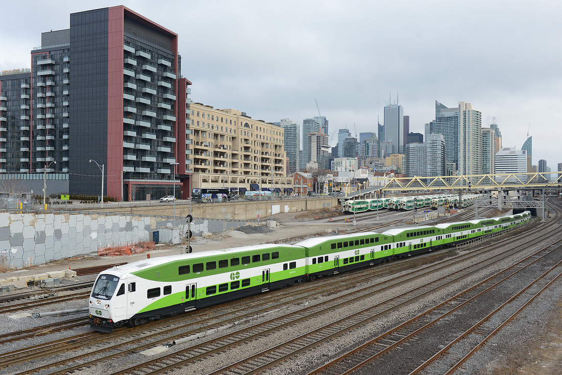
The new livery (featuring the new GO logo) uses two shades of green, one lighter and one darker than the old GO green, and is applied differently depending upon the vehicle type.
Locomotives and passenger cars see the darker green on the higher level, with the lighter, more vibrant green used on the lower section – a band of white breaks the two with the GO logo applied in this area. Black has been (rather sensibly) added to the bottom of the passenger cars essentially horizontally ‘lining up’ the livery up across the locos and passenger cars (less of the ‘up-and-down’ style of the old livery and more of a complete, continuous flow – visually, much neater).
[youtube https://www.youtube.com/watch?v=EIQW6eWLQJo&w=560&h=315]
On GO’s buses the livery is switched with lighter green toward the roof and darker green towards the wheels. Black again lines off the livery and provides a hiding place for dirt built up on longer journeys (meaning buses look fresher for longer). This new livery actually suits the architecture of GO’s buses more than previous, and in most cases, has made older buses look brand new – it’s amazing the power of a paint job!
As for brand touchpoints, GO stations (both bus and rail) have always tended to follow the same simple, yet bold design style. Everything is neat and tidy – no loud signs, over-the-top warning notices or flashy paint here, it’s all just refined to be what’s essentially needed, and nothing more. The ‘GO’ logo takes the place of what we might see as a BR ‘double arrow’ on our UK stations, a uniting symbol for the whole network. One thing of note however (and this still continues to this day) is the nice touch of the metal sculpted ‘GO’ on the roof of the bicycle huts, which also forms a bike shape too. All the hallmarks of what I like about GO, clever yet subtle and above all, well thought out.
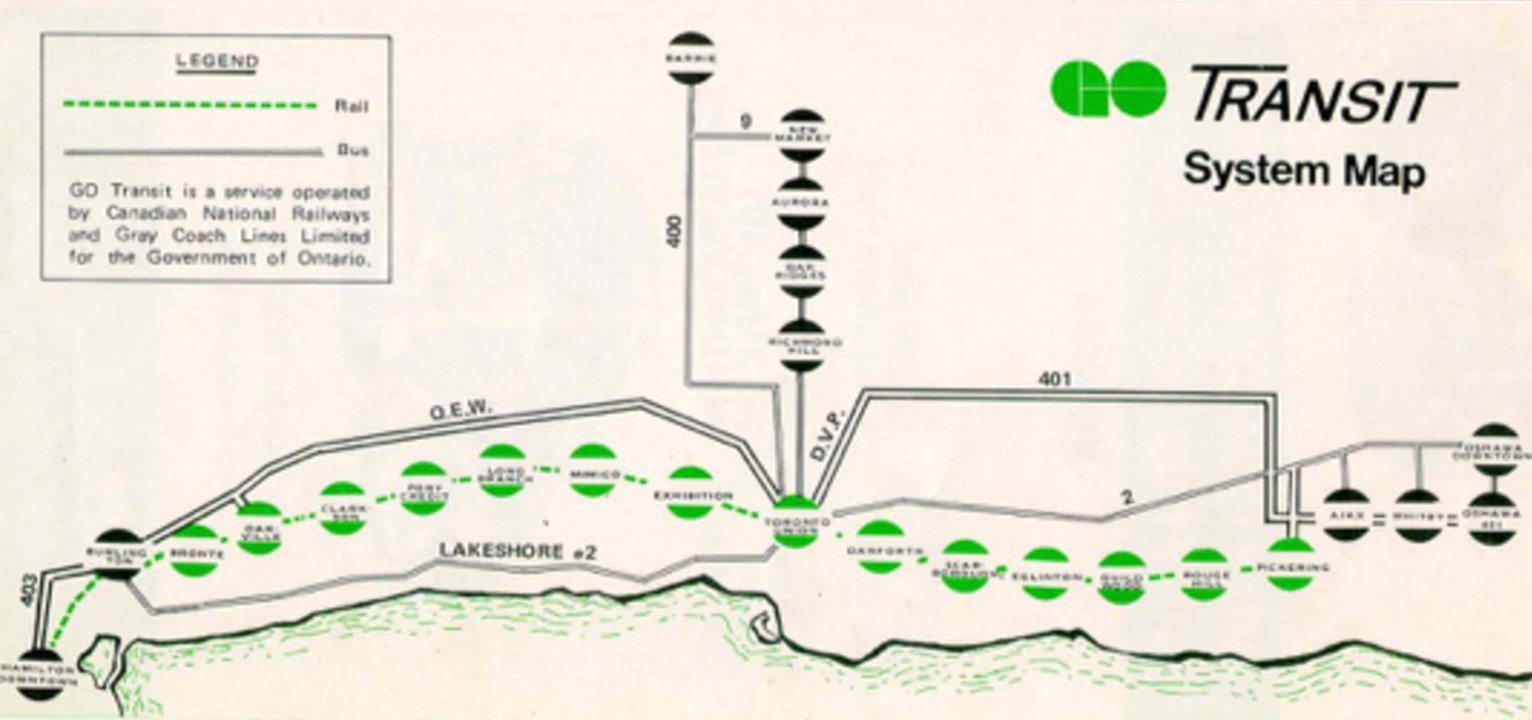
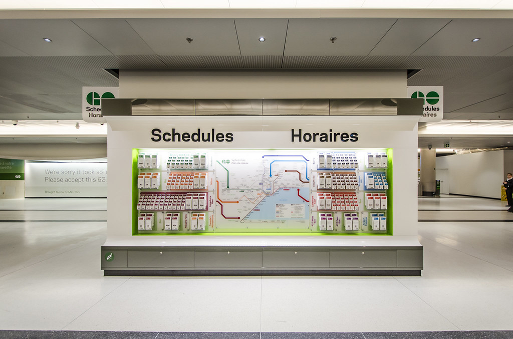
Customer information also continues the neat-yet-novel approach – route maps follow a distinct TfL style of coloured lines for regular services to set destinations, and the two shades of green flow across timetables, leaflet and all major branded consumables. The colours follow online, covering GO’s apps and their oyster-style ‘Presto’ card too.
GO have always utilised a more relaxed, casual tone-of-voice across their communications, conveying important and safety messages as they should but not being worried about having a bit of fun with their customers. This too has been ramped up under this new GO look, as the brand uses its tone-of-voice to appear more approachable, friendly and focused on its customers and locality, not just being a big, faceless transport provider. To me, it really works, and is a lesson to many other big city transport providers.
Not everyone wants to be shouted at by signs and instructed in every little detail, it’s about timely information presented in a way that seems conversational, rather than draconian. Don’t tell me what I can’t do, tell me what I ‘can’ do. Put things in the positive, don’t make it seem like it’s the end of the world. Maybe I’m generalising a bit here but still… it’s something I hate about some transport providers, and particularly love about GO.
[youtube https://www.youtube.com/watch?v=GwimLygL2sA&w=560&h=315]
All-in-all, the GO rebrand is doing exactly what it set out to do, modernising and regimenting their look into a single, cohesive appearance, and placing it alongside the best city transport providers across the globe. London has TfL (and its iconic roundel and red buses), New York has MTA (with its famous subway branding), and even though Toronto has long and proudly had GO Transit, it now has a visual style that places it alongside the best, and in my opinion, even above them too.
The future for GO Transit, under Metrolinx management, looks pretty bright. The famous Union Station in Toronto is under major refurbishment to allow more trains and greater opportunities for cross-transit integration. New stations have been opened, a seasonal service to Niagara Falls has been added and ‘every 30 minutes’ services introduced on key lines making it a truly turn-up-and-go regional transport service. Plans are also afoot to double peak rail services and quadrupole off-peak ones too, plus as long as the planned electrification of GO’s main routes go’s ahead, it will signal new rolling stock, new ideas and new possibilities, creating a modern commuter rail service (complimented by updated, innovative new bus and light rapid transit routes and services) like no other North American city.
With the population of the Greater Toronto/Hamilton areas set to continue to boom (estimated at 8.6million by 2031, up from the current 5.5million) the investment in Metrolinx’s ‘Big Move’ will form the backbone of what GO will become.
The eventual goal… to create one, harmonious, integrated customer-first transit system under the GO banner. They’ve planted their flag and proudly proclaimed that it’s time to shake off the image that GO’s services are designed and operated with GO’s needs in mind, rather than those of the customer. They have promised the comfort and convenience of the customer will be seen as the primary consideration in how services are planned, designed and operated. Regional travel will be made more convenient and barrier-free as customers transfer between modes, services and across municipal boundaries. Customers will have the information they need to make the best choices about whether, when, where and how they travel. Planning a trip with certainty, regardless of destination or mode, will be easier for all travellers, and commercial users.
And most importantly of all, GO Transit will strive to make Toronto transportation a more reliable and enjoyable experience for everyone. Brand-wise, I’m on board, are you?
Want to know more? Metrolinx’s big plans for GO from now until 2020 can be found here

