Paul Wilson, University of Leeds
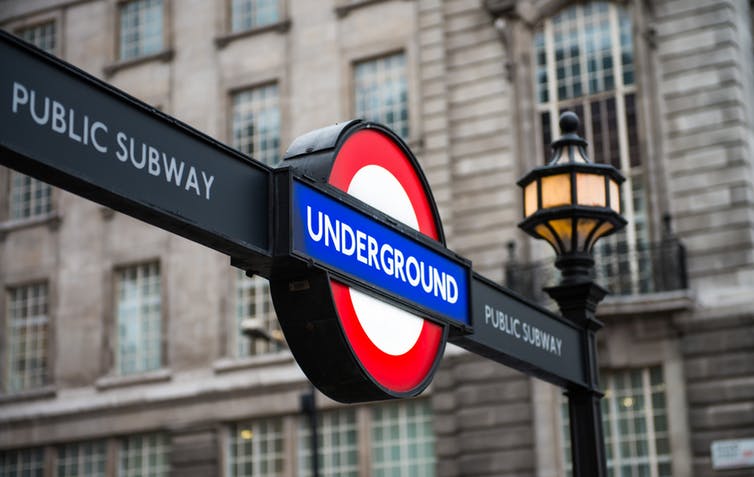
It’s been 100 years since the London Underground’s distinctive typeface made its first appearance. Alongside the unmistakable roundel, Johnston has helped to create some of the most recognisable signage in the world: a design which screams “London!”, no matter which language you speak. It has guided Londoners and visitors alike through the city’s complex and changing transport system for a century – it’s hard to imagine where we’d all be without it.
On the centenary of London’s most famous lettering, now is a good moment to reflect on how Johnston has shaped the city, and why words – and the way they’re written – form such an essential part of urban infrastructure.
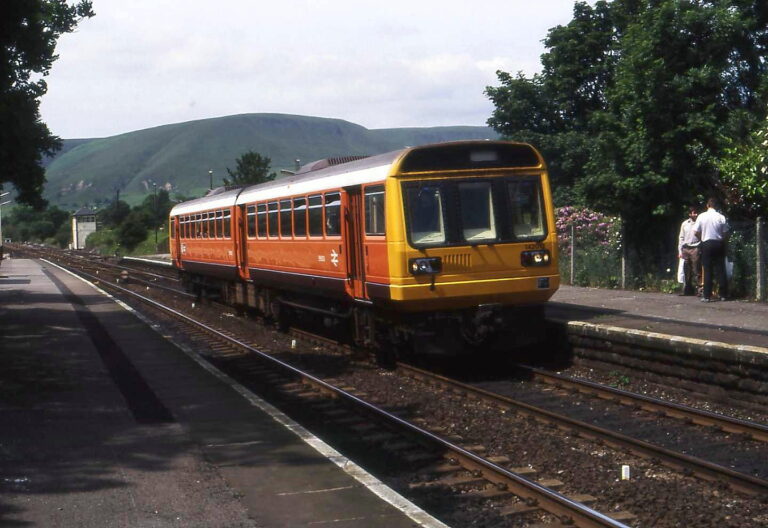
The development of modern cities and transport systems called for new tools to help people negotiate urban life: new technologies for finding our way, new systems for naming, new rules to preserve order and avoid accidents – and, of course, new visual forms to communicate all of these things. Every city has tackled these tasks in a slightly different way, and London made progress thanks to the efforts of many different people.
For instance, in 1854, physician John Snow mapped the cholera epidemic in London. Not only did he manage to locate the source of the outbreak (a water pump in Soho), his designs also helped those in power to understand the needs of the people. His maps were consulted during the development of crucial sanitary and plumbing works.
Later, during the 1930s, Phyllis Pearsall also helped to forge the path, by creating an alphabetical index of London. Pearsall’s Geographer’s A-Z Map became a milestone of design and transformed the way place can be understood, by recasting the city’s then 23,000 streets into an easily navigable list.

Designing London
While the likes of Pearsall and Snow responded to the city’s surface, others turned their attention underground. In 1908, three events transformed London’s nascent underground railway: both the roundel symbol and the word “Underground” appeared for the first time in stations, and the network’s first machine-made tickets were issued.
These innovations were part of managing director Albert Stanley and then-publicity officer Frank Pick’s plan to rescue the ailing Underground Electric Railway Company of London. From this, a brand was born, and calligrapher Edward Johnston was commissioned create a typeface as visually striking as the roundel mark. In 1916, it was rolled out right across the city.
For Johnston, the alphabet’s most important letter was “O”. Along with the “I”, its purity and character drives the form of all others. For inspiration, he turned to one of the Roman alphabet’s most critical touchstones: the Trajan column. Located in Rome and constructed in around 117AD, the column celebrates Emperor Trajan’s military victory in the Dacian wars with an inscription of six lines of letters.
It was the unadorned, uncorrupted form of the column’s square capitals that defined the character of Johnston’s typeface, which strove to represent a humanist essence among the chaotic visual landscape which was emerging above and below ground in London in the 1930s. Advertising and branding were colonising the everyday visual space, and competing for the attention of passengers and pedestrians through a veritable typographic storm.
But Johnston had a more radical intention: to create a typeface that was understated, quotidian, ordinary – a part of the consistent background, rather than a changing foreground. It’s this quality which perhaps explains the design’s longevity; the way it has become a feature of the city’s landscape, seeped into its infrastructures of government and, of course, transport.

Changing face
The typeface’s 1979 redesign by Colin Banks and John Miles placed Johnston at the centre of a strategic rebranding for London Transport. They reined in some of Johnston’s typographic idiosyncrasies, by reducing the ratio between a stroke’s height and thickness, and breaking the rule that the stroke of a letter must be a constant width.
These interventions helped to shape the typeface that so powerfully embodies the character of the city; steeped in history and tradition, while striving towards an ideal of modernity; resolute and resourceful, unique and efficient.
In the 21st century, we’ve seen Johnston’s lettering extend beyond the functional and into the political, after it was adopted by London’s mayor and assembly. Now, 40 years after Banks and Miles’ redesign, global type agency Monotype have retooled Johnston for new platforms, trends and media. Notably, they have introduced thinner weights for digital use and, for the first time, the hash (#) and at (@) signs.
![]() Like London, the typeface is subject to the push-and-pull of its own sense of self and history: one feature of Monotype’s Johnston100 redesign was the return of those quirks and idiosyncrasies that fell by the wayside in previous reworkings. The versatility of Johnston’s remarkable letters show how such superficially simple characters can powerfully influence the way people experience the city. It is the “voice” which helps people to get around – a comforting familiar presence amid the chaos of the morning commute.
Like London, the typeface is subject to the push-and-pull of its own sense of self and history: one feature of Monotype’s Johnston100 redesign was the return of those quirks and idiosyncrasies that fell by the wayside in previous reworkings. The versatility of Johnston’s remarkable letters show how such superficially simple characters can powerfully influence the way people experience the city. It is the “voice” which helps people to get around – a comforting familiar presence amid the chaos of the morning commute.
This article was written in 2016 by Paul Wilson, Lecturer in Communication Design, University of Leeds.
This article was originally published on The Conversation. Read the original article.
Don’t forget to follow us on Twitter – @transportdsn.