If you saw our recent blog post ‘10 UK bus liveries we really, really miss’, you’re probably also aware of the tidal wave of ‘Hey, what about London and Country?!’ comments it generated. Part 2, however, is for another day – today, we’re focussing on the present.
This was an incredibly difficult ‘top 10’ to curate, with so many excellent liveries and colour schemes prevalent throughout the UK in 2016. In pulling together this list, it has become apparent that liveries are no longer simply glorified wallpaper for buses. There has been a seismic shift in terms of the way operators think about their brands. Driven in part by the excellent creative work undertaken by Ray Stenning’s Best Impressions (for which we make no apology that their work rightly dominates our top 10), today’s most forward-thinking brands are all about enhancing the customer experience.
Without further ado, let’s jump right in…
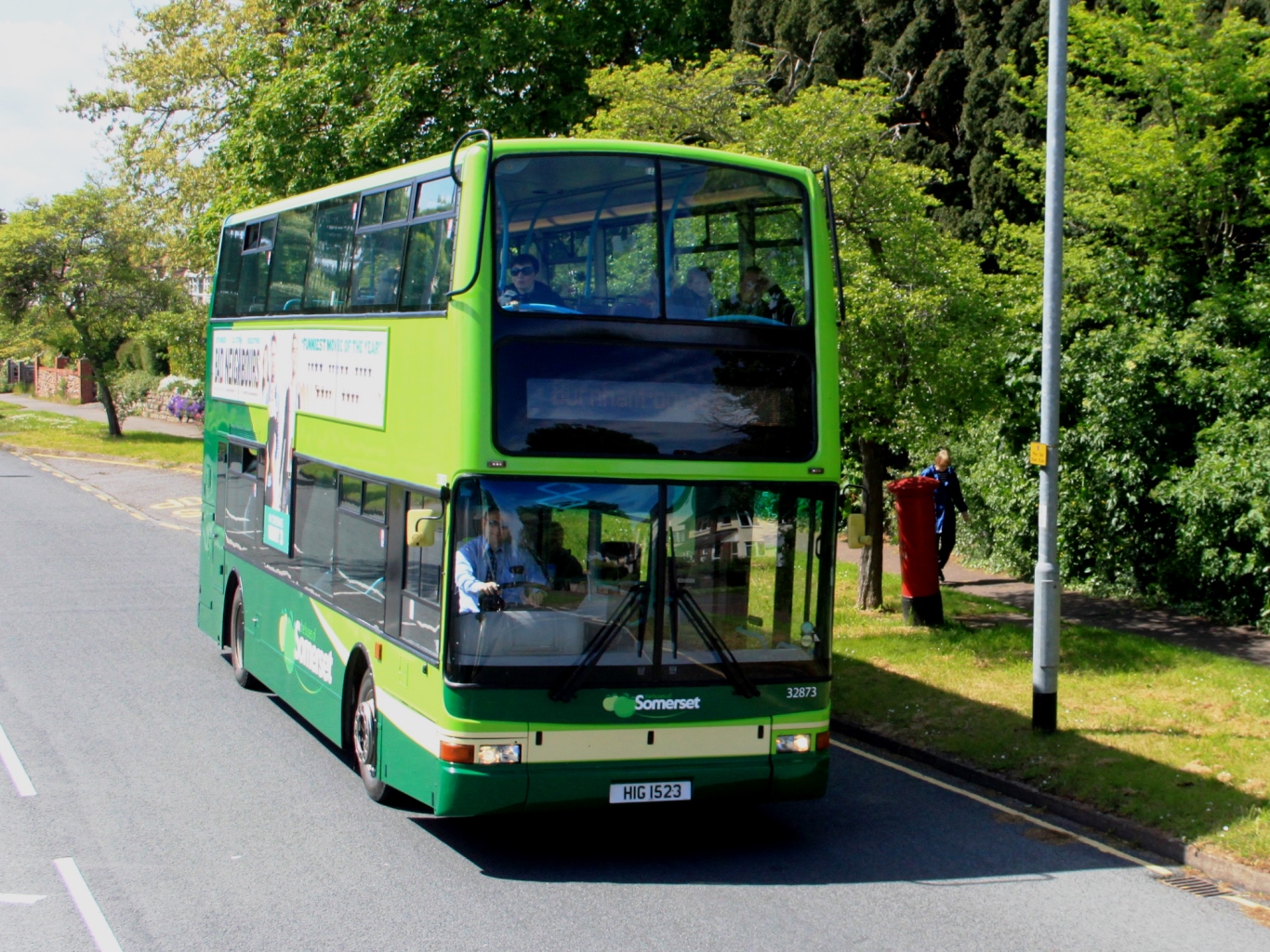
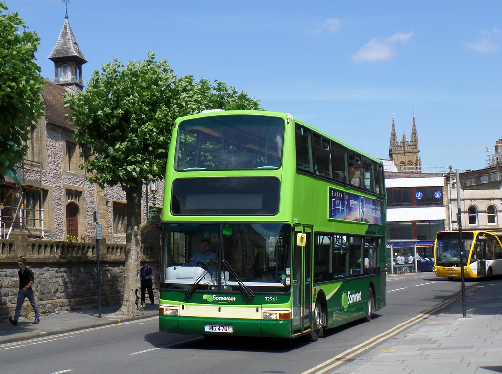
10. Buses of Somerset
Inspired by the leafy green orchards and cider farms of beautiful Somerset, First’s shift towards establishing strong regional identities across its UK bus operations is evident here.
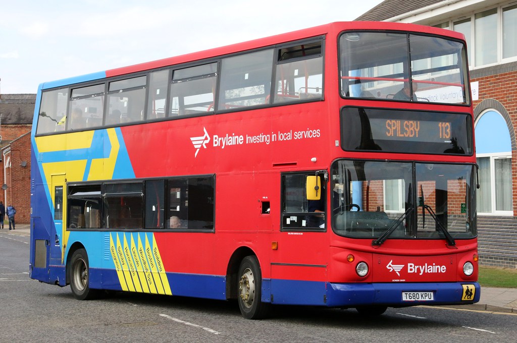
9. Brylaine
Often forgotten and always under-appreciated, Lincolnshire operator Brylaine’s bold colour scheme is clean, modern, chunky and robust.
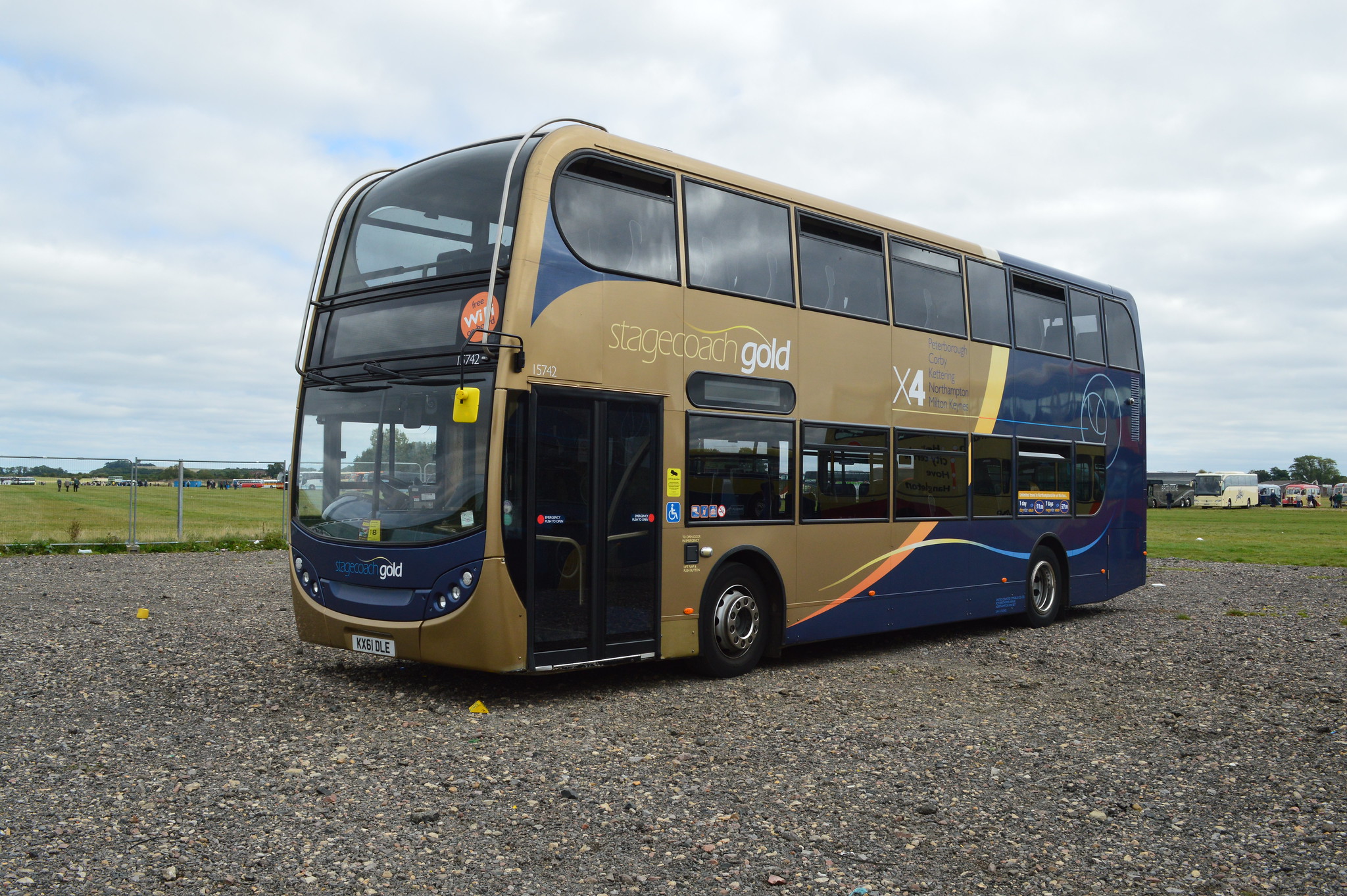
8. Stagecoach Gold
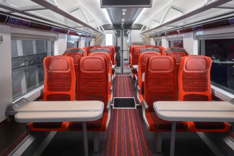
Stagecoach really was the pioneer in creating a template for ‘business class’ interurban bus travel, which has now been rolled out in a number of locations across the UK. The gold and royal blue exterior, combined with interior mood lighting and coach-style seating really helps to distinguish these vehicles from their ‘beachball’ cousins.
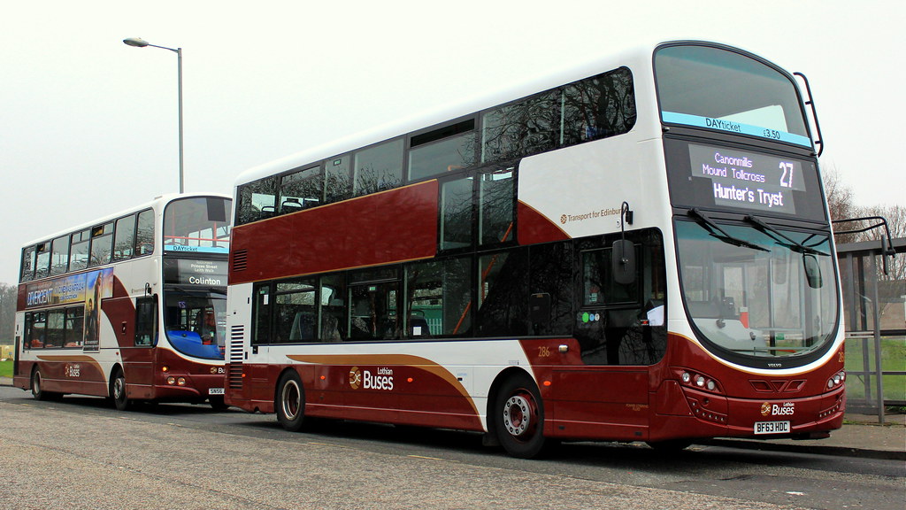
7. Lothian Buses
Lothian’s livery is truly versatile and lends itself well to almost any type of vehicle, particularly the latest offerings from Wrightbus.
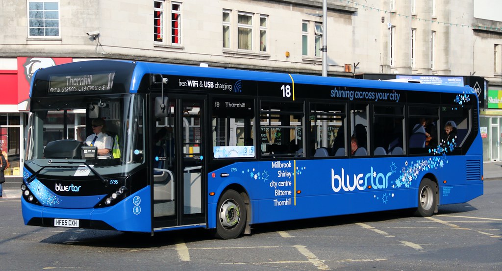
6. Bluestar
There’s something deeply satisfying about the shade of blue used for the Bluestar brand. The latest incarnation of the brand sees a tasteful thin yellow vertical stripe delightfully picking out the subtle route branding.
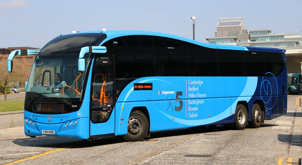
5. Stagecoach X5
Perhaps one of the most eye-catching, jaw-dropping liveries ever to grace a coach. However, it’s not the only branding applied to the stunningly curvaceous Plaxton Elite which has made this list…
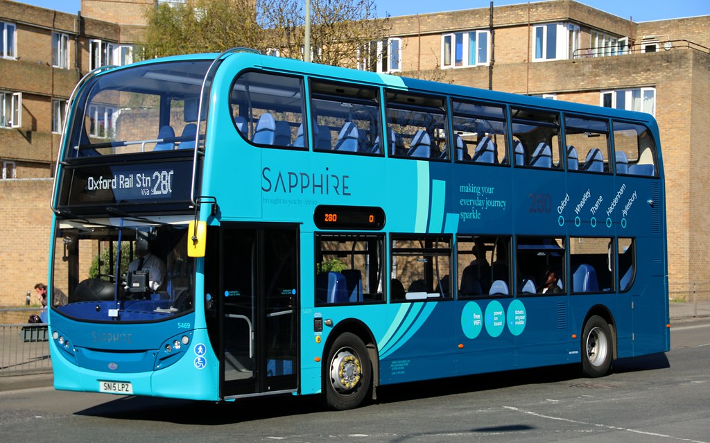
4. Arriva Sapphire
First we had Gold, and now we have Sapphire…Arriva’s sparkling premium bus brand dangles the commuter a carrot, squarely aimed at tempting potential customers out of their cars.
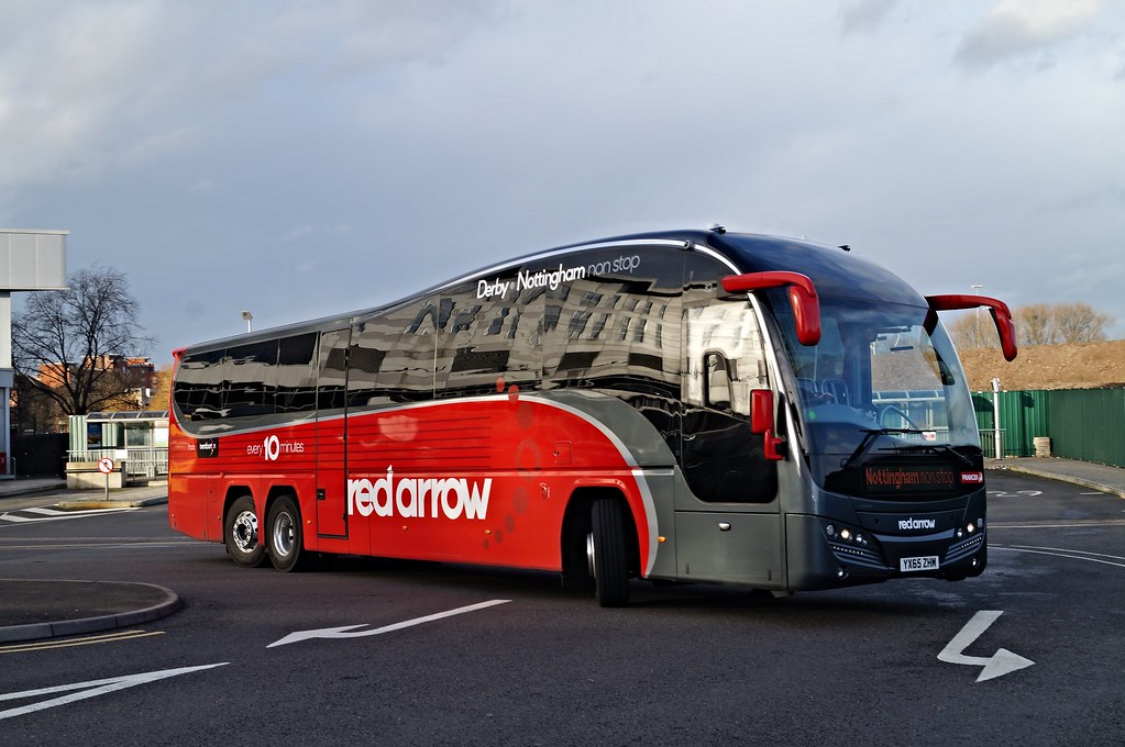
3. Red Arrow
Trent Barton’s revised Red Arrow literally stole the show at Coach and Bus Live 2015 (check out our round-up of that event). On the streets of Nottingham and Derby, there is quite simply nothing else to compare it to – it commands respect in every way imaginable.
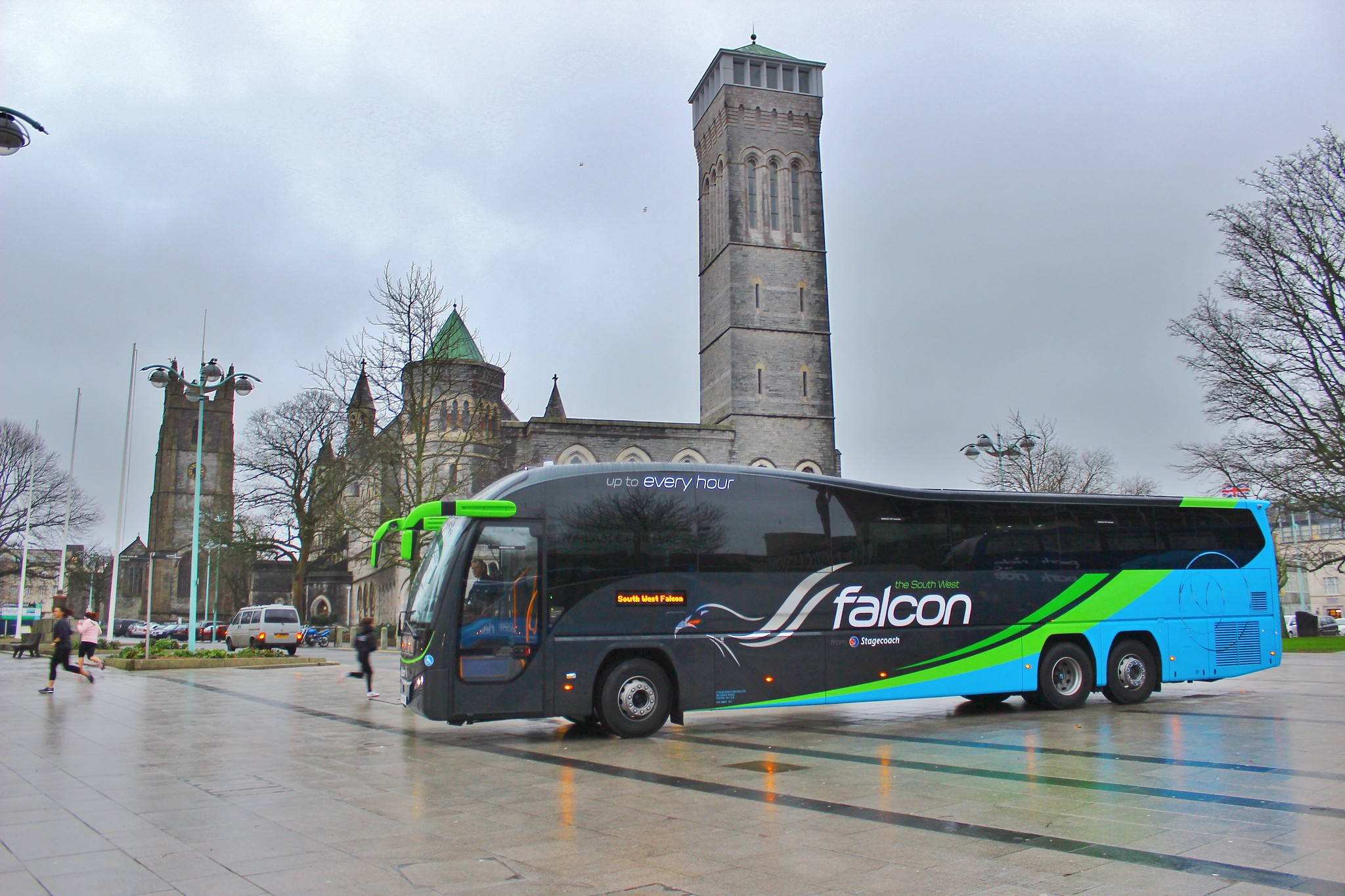
2. Stagecoach Falcon
Yes, it’s a triple whammy for the Elite as Stagecoach South West’s striking ‘Falcon’ brand swoops in at number two. The triadic colour scheme is delightful; the powerful bright green beautifully picks out the Elite’s unmistakeable rounded features.
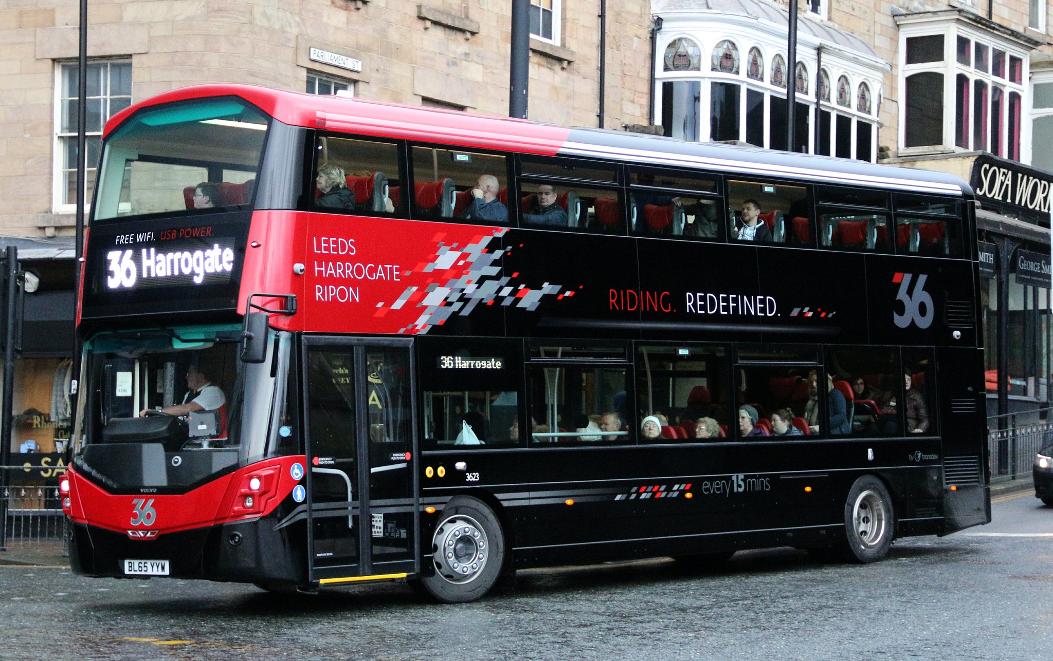
1. Transdev Harrogate’s 36
If you came here hoping to be surprised, we’re very sorry to disappoint. Let’s face it – there’s only one bus operator which has truly ‘redefined’ vehicle branding in 2016 – Transdev in Harrogate with their 36. Perhaps Best Impressions’ finest hour to date, it’s hard to see what, if anything, is going to come along and beat it – until the next incarnation of the 36 lands, of course.
So, that’s our ‘top 10’ of all that the current UK bus scene has to offer – which liveries would make your list? We’d love to know – write in the comments below, or drop us a tweet @transportdsn.
And before you go – how about a trip down memory lane?

