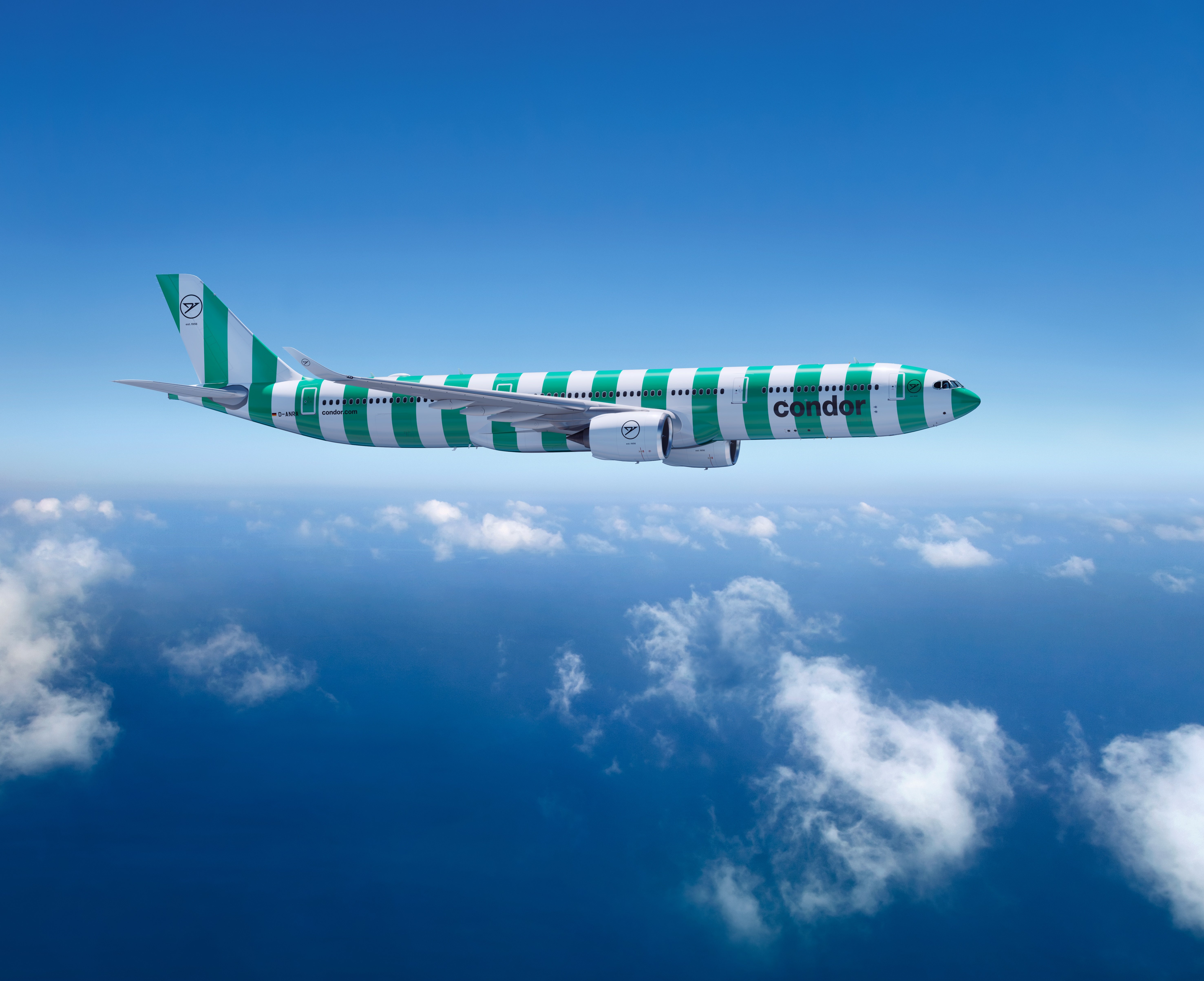
German charter airline Condor have launched their new livery – or more accurately, a whole new brand – and it’s fair to say that it has divided popular opinion straight down the middle.
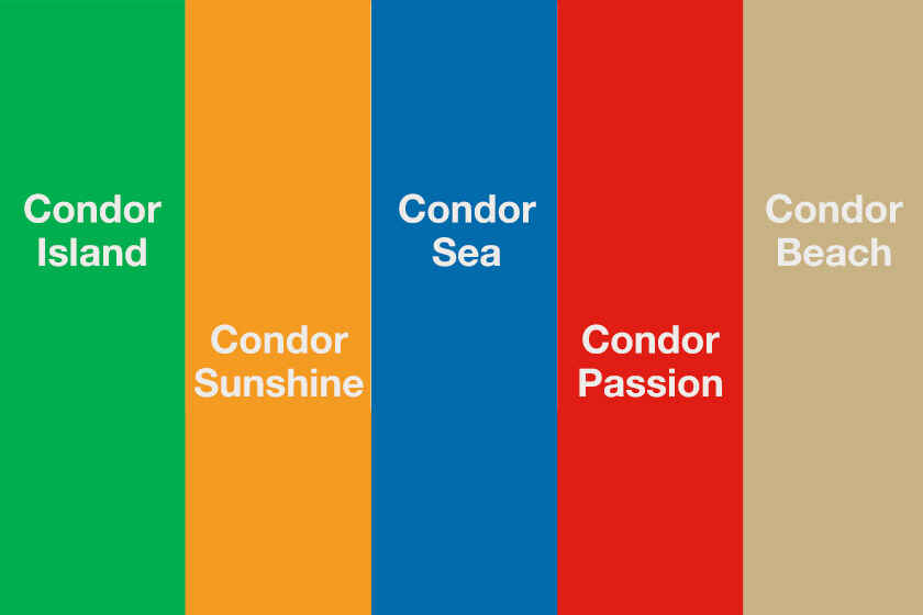
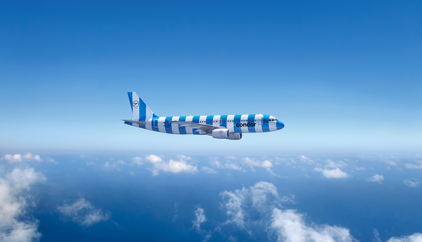
‘Passion is our compass’, Condor have claimed in the publicity accompanying the unveiling of their new brand. Their rebrand is centred on five pillars – Island, Sunshine, Sea, Passion and Beach – each with its own vibrant colour taken from a distinctly beach ball-esque palette. And, to be fair, it’s not so much Condor’s new colours which have captured attention, but rather, how they’re going to be used.
Condor have created a new livery for their fleet of mainly Airbus aircraft, which features the new colours looped around the fuselage to give each plane the look and feel of one humongous, airbourne beach towel with wings. It’s the antithesis to the recent trend of ‘eurowhite’ liveries – formulaic, bland aircraft painted white and featuring a tail picked out in some random colour or stylised national flag.
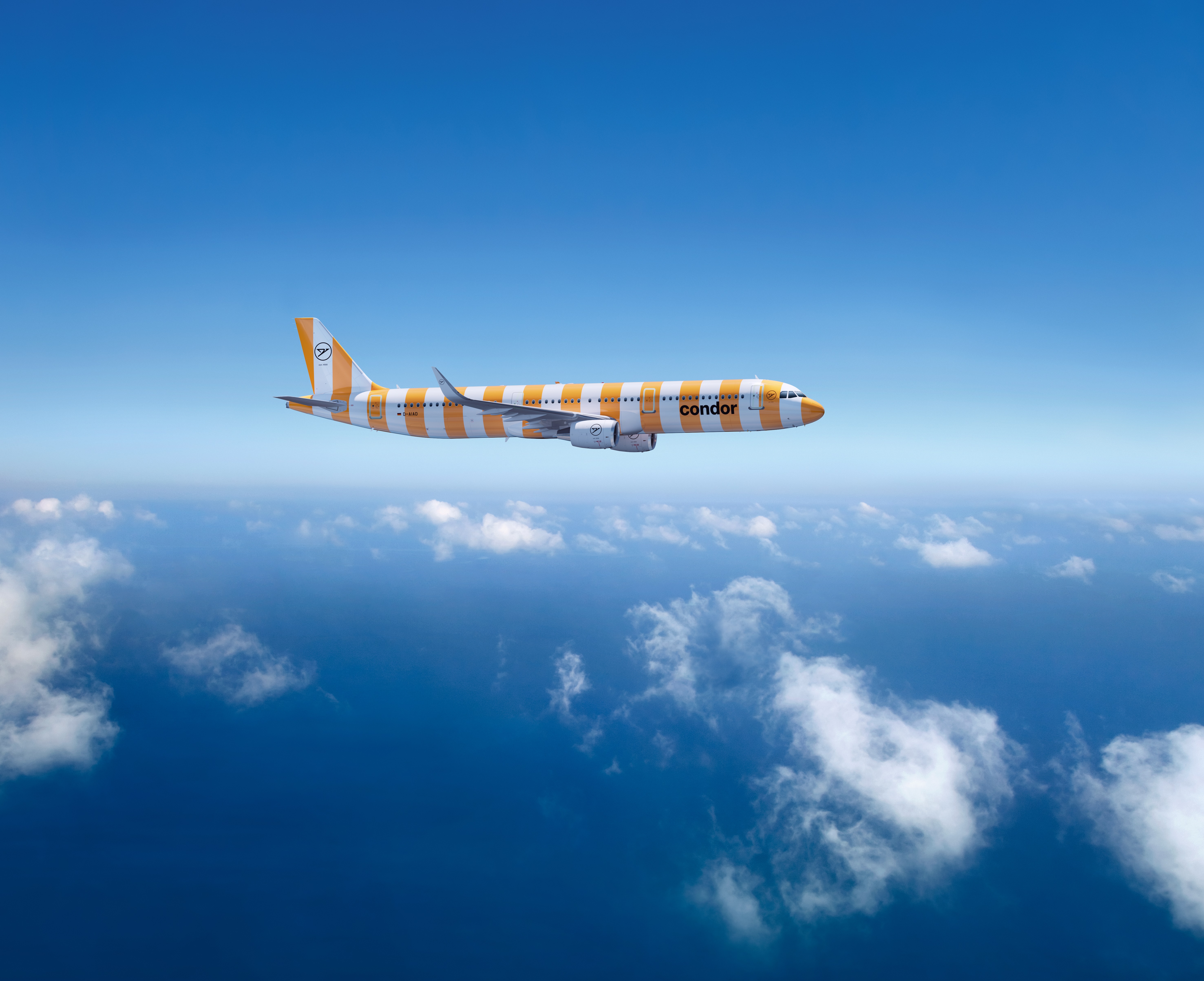
Eurowhite, this is not.
And neither is the vision set out by Condor alongside their new livery. Yes, there’s plenty of talk about ‘passion’, which is about as cliched a vision as they come, but it’s clear that Condor want to be seen as a uniquely-spirited airline, keen to stand out amongst a sea of euro-blandness.
Condor are a holiday airline. Their new livery is designed to get small boys and girls excited about their holiday as they wait in the lounge whilst their parents wish away the hours by slowly sipping over-priced airport beers. It’s certainly not designed to appeal to besuited sales executives, nor – dare we say it – aviation purists. When you look at the positioning through the lens of the intended target audience, it’s clear to see why such a bold step away from the norm fits the brief perfectly.
So, why some of the negativity?
Well, it’s a well-known fact that some people just don’t like change. Dating back to 1955, it’s true that Condor is an airline with plenty of history, and one which currently boasts of a couple of retrojets to boot. But right now, the Condor fleet is more ‘messy hotel room’ than ‘fresh beach towel’ in appearance, with a mish-mash of liveries adorning their planes, everything from the former Thomas Cook-inspired colour scheme to boring, bland and wholly uninspiring whites and greys.
So more than likely, what’s difficult to accept is the fact that Condor’s new livery and brand is such a radical departure from anything we’ve seen in recent years. Sure, we’ve seen some pretty insane creations appearing in our skies in the past (including Hello Kitty jets we’ve featured here on Transport Designed) from the likes of Eva Air. But in brand positioning terms, the new branding is a bold step – and it’s sure to get Condor noticed.