Frequent flyers may have noticed that their jets have been looking a little different lately.
American Airlines underwent something of a re-brand during the first quarter of 2013. Working with FutureBrand, AA strived to bring itself into the 21st Century with a more streamlined, modern image.
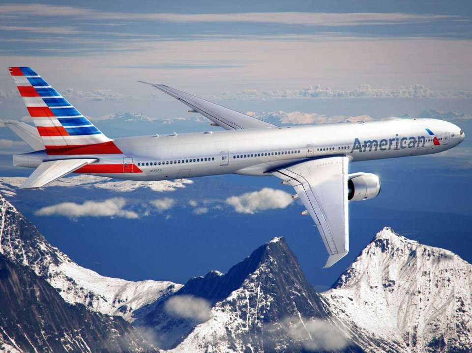

Gone (well, sort of) is the famed American Eagle, simplified and replaced in the new logo by… a beak.
Some of the timeless AA brand features have been retained – those American-inspired colours of red, blue and silver, and the classic ‘American’ identifier across the hull of the aircraft.
The re-brand doesn’t stop with the aircraft however…a crisp and clean new website, refreshed airport terminals and print materials complete the transformation.
Critical to the success of the work was the objective to reflect on and retain American’s iconic history, whilst creating an image fit for 2013 – no mean feat, but something which FutureBrand has done extremely well.
Check out what went on behind the scenes.
[youtube http://www.youtube.com/watch?v=J-KD0PdI1Ek]

