Let’s start with a question.
What makes a good network map?
Well, the answer is just as simple as you might think.
The purpose of a network map is to visually represent the places which can be reached on any given transport operator’s network, and how to get there.
Or at least, that’s what a good network map should theoretically do.
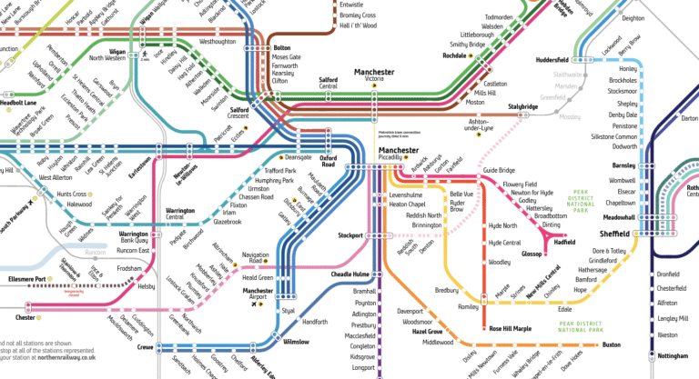
This fairly simplistic thinking was the catalyst behind our idea to redesign Northern’s existing network map. Northern is Britain’s second-largest train operator and manages over 470 stations, with 2,650 trains a day calling at more than 500 stations in total.
But where can I actually go?
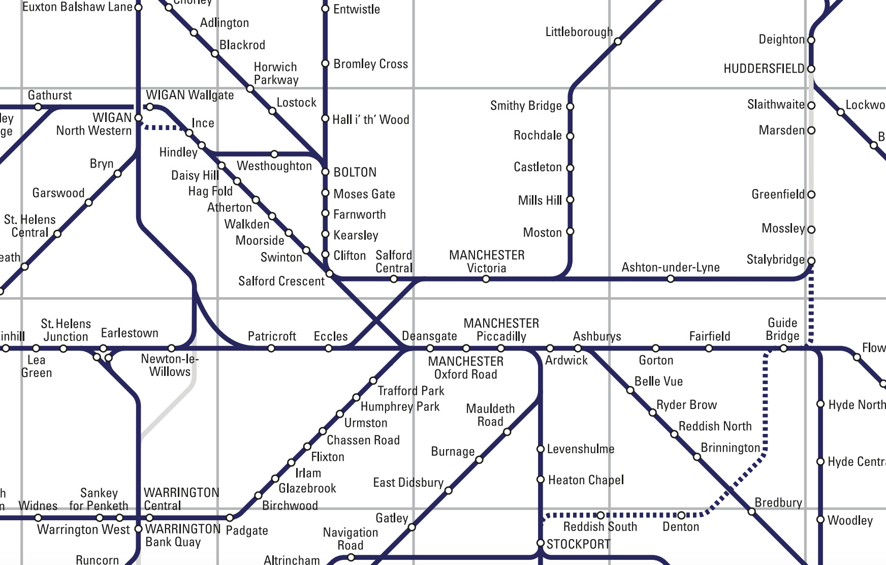
Northern’s historic network map, whilst representing the sheer size and scale of the train operator’s network, didn’t actually show you where you could travel to and from.
It represented the network as an amorphous blob of interconnected dark blue lines, but did nothing to communicate the intricacies of how to actually get between any two places.
That was our starting point.
How do you represent such a vast network, and make it make sense in a way that customers can quickly and easily understand?
Dismantling the network
The first step was trying to decide exactly where to ‘centre’ the map. This would determine the entire structure of the map, and how it would all eventually fit together.
The transpennine links between Manchester and Leeds – via Bradford over the ‘Calder Valley’ route, and the actual Transpennine route via Huddersfield, seemed a good place to start. Deciding how to represent the links between these locations was the first challenge – but from the outset, Huddersfield was officially the centre of the universe. Congratulations, Huddersfield.
Next, we determined how the Northern network would be presented sitting between the two North-South routes – the West Coast Main Line (WCML) and the East Coast Main Line (ECML). The routes of both the WCML and ECML were roughly plotted, soon to be criss-crossed by Northern’s patchwork of services.
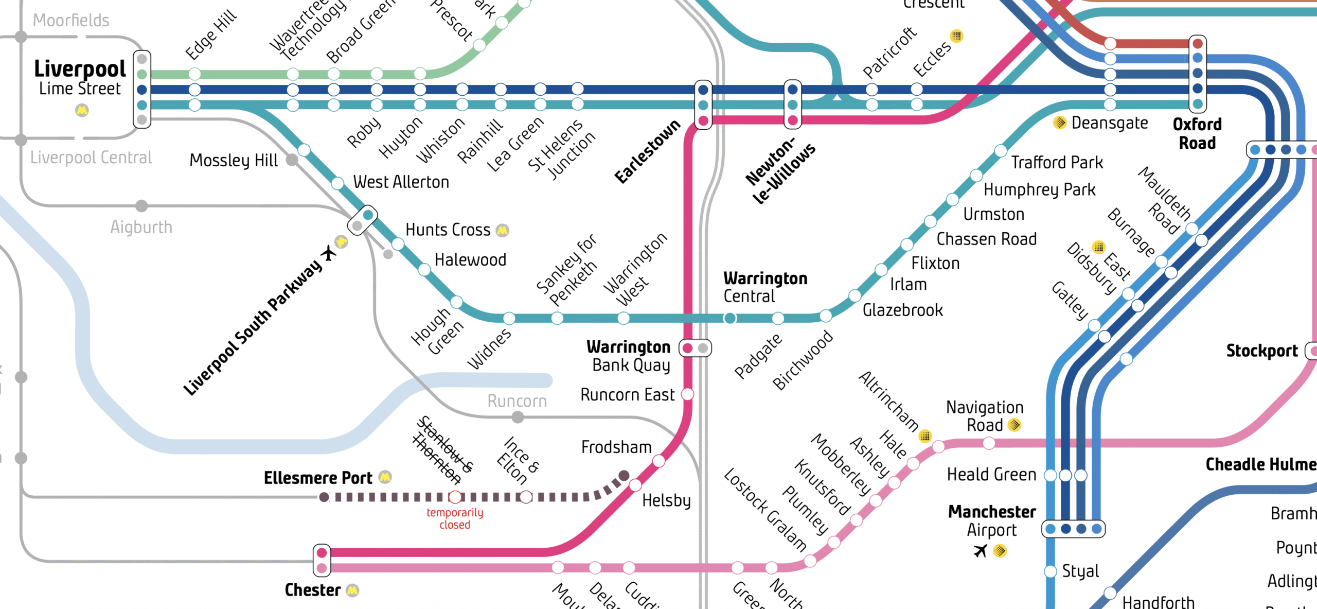
Manchester, Huddersfield and Leeds are extremely well-connected, so it was a logical place from which to start mapping these services. The Leeds-Chester route, for example, enabled lines to be drawn from Manchester through to Newton-le-Willows, Chester and Liverpool, and from there followed pretty much the entirety of Cheshire and South Manchester.
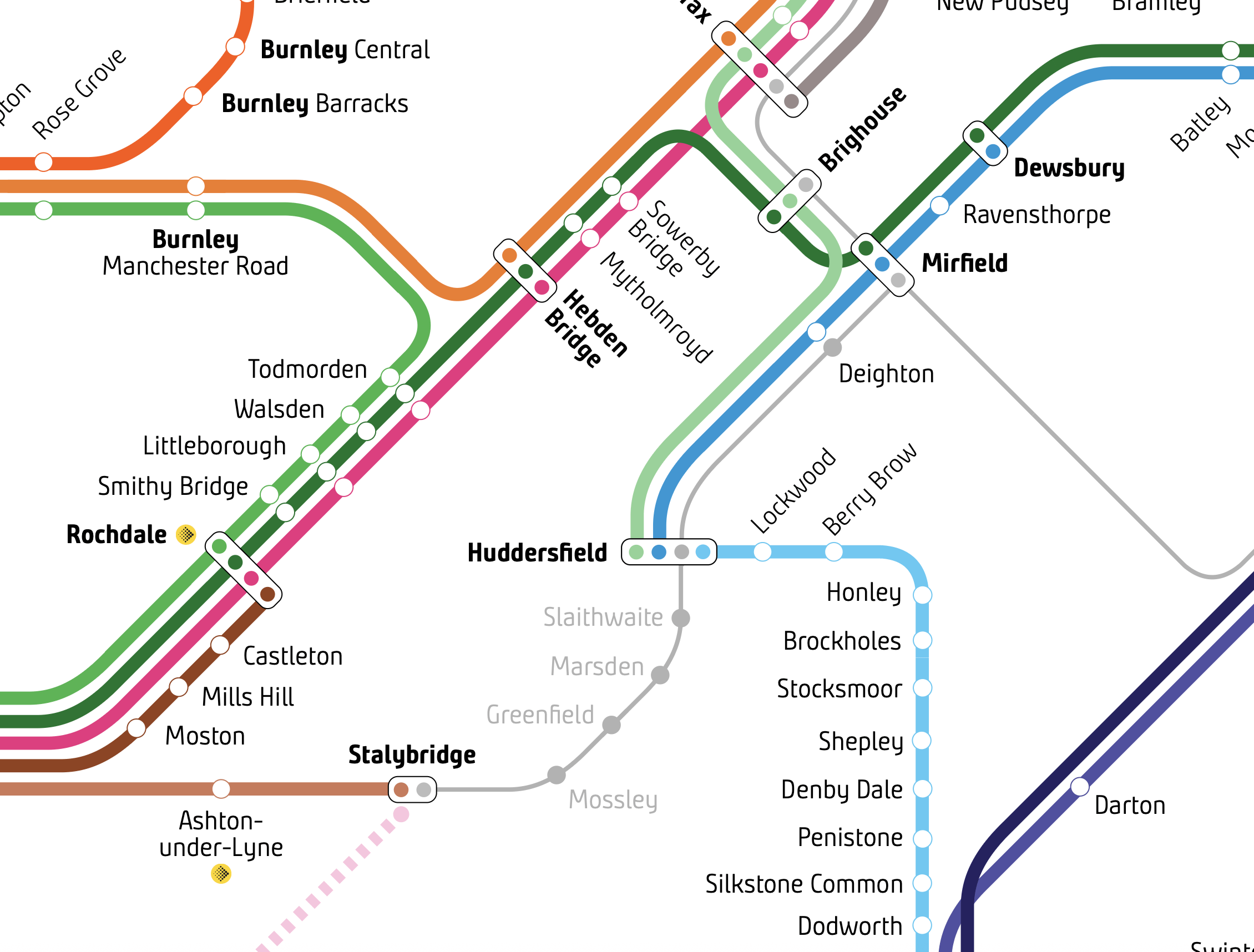
Representing service patterns
On Northern’s original map, all stations were represented equally. But there was no indication that trains only stopped at Brigg once a day, or that certain stations on the busy Manchester Airport line were only served by certain trains.
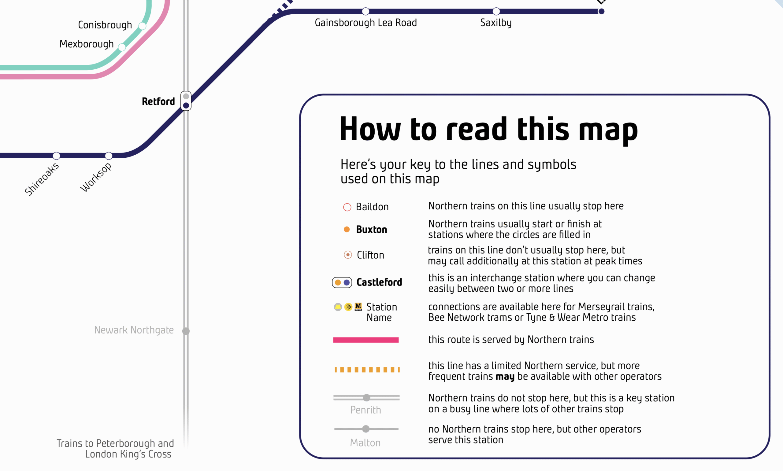
A hierarchy of thick-weighted multi-coloured lines now represents Northern’s ‘core’ services, which are differentiated from occasional services (dotted lines), other operator’s services (thin lines), and routes served by other operators represented where it makes sense to do so for completeness and clarity (grey lines).
A good example of this hierarchy in action can be seen between Liverpool and Crewe. Technically, it is possible to use Northern trains to travel between these two places, but a much faster link is available on another operator’s services (via Runcorn), where Northern trains do not run.
Grouping
Another key principal of the new map is the grouping of services. There are some lines where services are so frequent, and have such similar calling patterns, that it does not make sense to split them out as single lines.
The network of frequent electric train services on the Airedale and Wharfedale lines, linking Leeds with Shipley, Bradford Forster Square, Ilkley and Skipton, is one such example. The stations between Leeds and Skipton are also served by longer-distance Northern trains, which stop at fewer places.
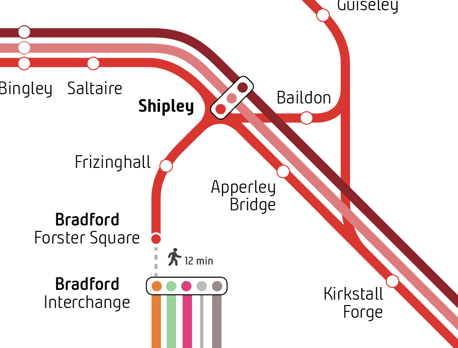
Shipley station, with its triangle-shaped design featuring platforms on each edge of the triangle, presented a unique cartographic challenge when it came to representing how trains interact at this station.
Some key challenges
On a network of this size, simply understanding the sheer number of service patterns and individual lines and stations was a challenge in itself. But there are certain places – like Shipley – that defy traditional logic, and needed some creativity to solve.
The map uses a strictly-defined set of curves and angles to maintain a uniform look and feel – best seen when you zoom out and look at the network as a whole. Not only is this pleasing to look at, but it serves a practical purpose – it ensures familiarity regardless of where you are travelling to and from.
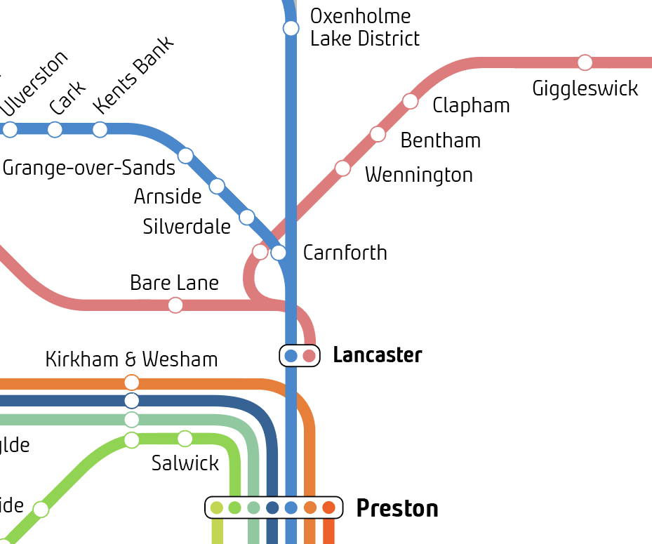
Carnforth presented a particular problem – a station which for all intents and purposes, is on the West Coast Main Line – but with no platforms for trains on the WCML itself. In order to make it not appear like trains on the WCML stopped here, and unique 90-degree foldback solution was created for the Bentham Line services towards Leeds, rather than showing this as a simple line up from Lancaster bearing off to the right.
That’s another principle of the map – it is a schematic. It represents what trains do, not where or how they travel geographically.
You’ll see this principle employed at places like Sheffield, where it makes sense for the line towards Lincoln to drop down through the station and carry on rather than using a ‘turnback’. At Manchester Airport, some trains carry on towards Styal and Wilmslow, but from a customer perspective, it makes sense to show this service carrying on ‘through’ the station.
And just to complicate things – it’s not a universal rule. Politics plays a part. There is political ambition for a new ‘through’ station to be built to serve Bradford – so it makes sense here to represent the ‘out and back’ situation at Bradford Interchange, which is universally understood and forms part of the political arguments for a faster route through the city.
Maybe one day, Bradford will get its through station, and we’ll need to update the map.
Accessibility
The key to making a network map more accessible is making it accessible for all.
The new Northern network map employs a range of features to ensure the network is readily accessible to everybody, including colours, individual lines, clear labelling and more. Stations where interchanges between lines are possible are marked with rounded rectangles to show the best places to change trains.
Landscape features, such as rivers, bays and national parks – completely missing from the old map – are used sparingly to help ground the map in reality, and help users understand their position in relation to nearby routes and stations.
And clear labelling alongside an easy to understand map key are central to being able to understand the map. Plain English is used to explain symbols and legends across the map.
What’s next?
The map has already been rolled our across Northern’s website and will soon be appearing on stations. It will form part of a wider package of work to position and promote Northern’s routes.
But that’s not the end for the development of the map.
We’re already on version 2 following lots of customer feedback, and later versions will introduce new features further down the line.
From a wider perspective, we’re looking to develop an ‘all-TOC’ North of England route map in a similar style, to really showcase the scale of the wider network available across all operators’ services. Look out for that one dropping later in the year.
And with any project of this size and scale, there are bound to be mistakes, learnings and intricacies that weren’t properly understood – please do keep your comments coming in, so we can build on them and make the map the best it can possibly be.
If you have any feedback, questions, observations or would like to speak to us about a new project – please do get in touch. We’d love to hear from you.