The world of transport has given us some of the most amazing, iconic and unforgettable logos.
Recently, we set out to accomplish the impossible and find a list of the most important, classical, historical and inspirational of them all. We asked you, our friends and followers, to nominate your favourites and to tell us your reasons why they’d make your list.
Hands down, this list was probably the most difficult list we’ve ever had to curate. There are literally thousands of logos from the world of transport, and even once we’d sifted through the crud, whittling them down to a shortlist of just ten was never going to be an easy task.
With your help, here’s what we came up with.
10. Caledonian Sleeper
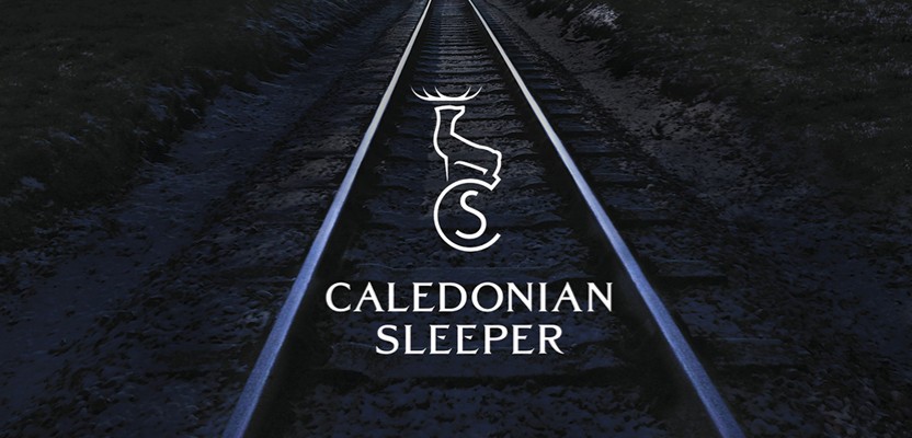
Weber Shandwick’s White Stag for the Caledonian Sleeper is a lesson in elegance.
Inspired by the route which runs from London to Fort William – known affectionately as the Deerstalker to many – the Stag features cleverly-sculpted five-point antlers representing the Sleeper’s three Highland and two Lowland destinations.
Twinned with a striking, purebred Scottish livery of deepest blue, the new identity for the Sleeper is in a totally different league from the dreary collision of corporate purple, white and pink it replaced.
9. Muni
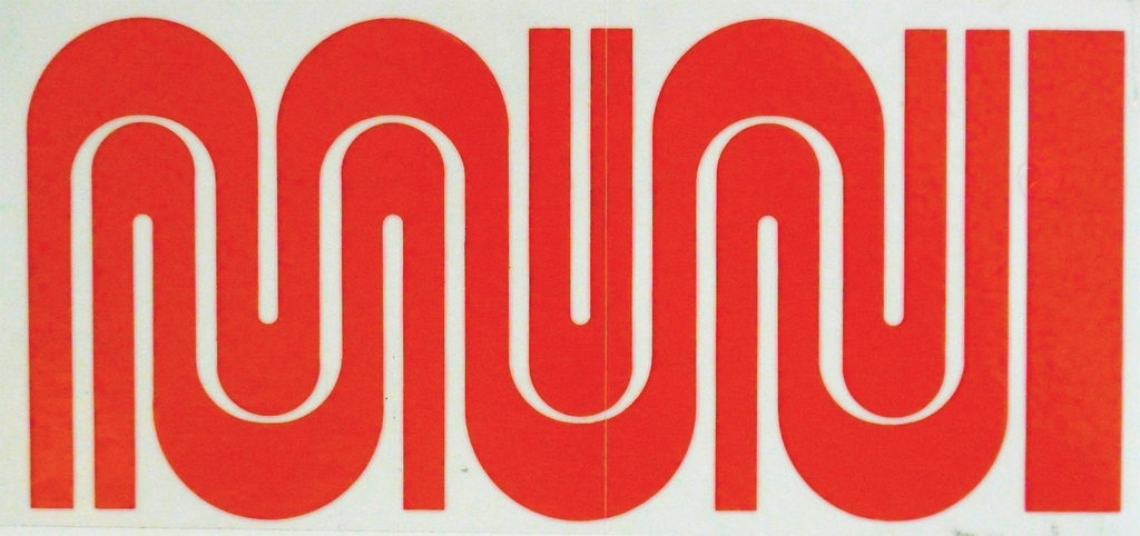
Arguably one of the most famous logos of all time from the world of transport is San Francisco’s ‘Worm’.
Designed by SF-based Walter Landor, of Landor Associates, the Worm debuted in the 1970s. It forms the word ‘Muni’, short for the ‘Municipal’ in ‘San Francisco Municipal Railway’. The smooth, flowing lines reflect the geography of the physical lines themselves, which snake around the streets of San Francisco in a spaghetti-like fashion.
Thanks to Nicholas Rogers for the suggestion.
8. GO Transit

Suggested by our very own Sam Jessup and proving the theory that simplicity is best, the GO Transit logo has to be one of the most under-appreciated and overlooked logos of all time.
Designed by Frank Fox at Gangon/Valkus in the late 1960s, the logo cleverly incorporates the ‘T’ in Toronto within the Government of Ontario’s initials. Two beautifully crafted circles are turned into initials by the simple conversion of one quarter to a square, with the T picking out the rest of the letterform.
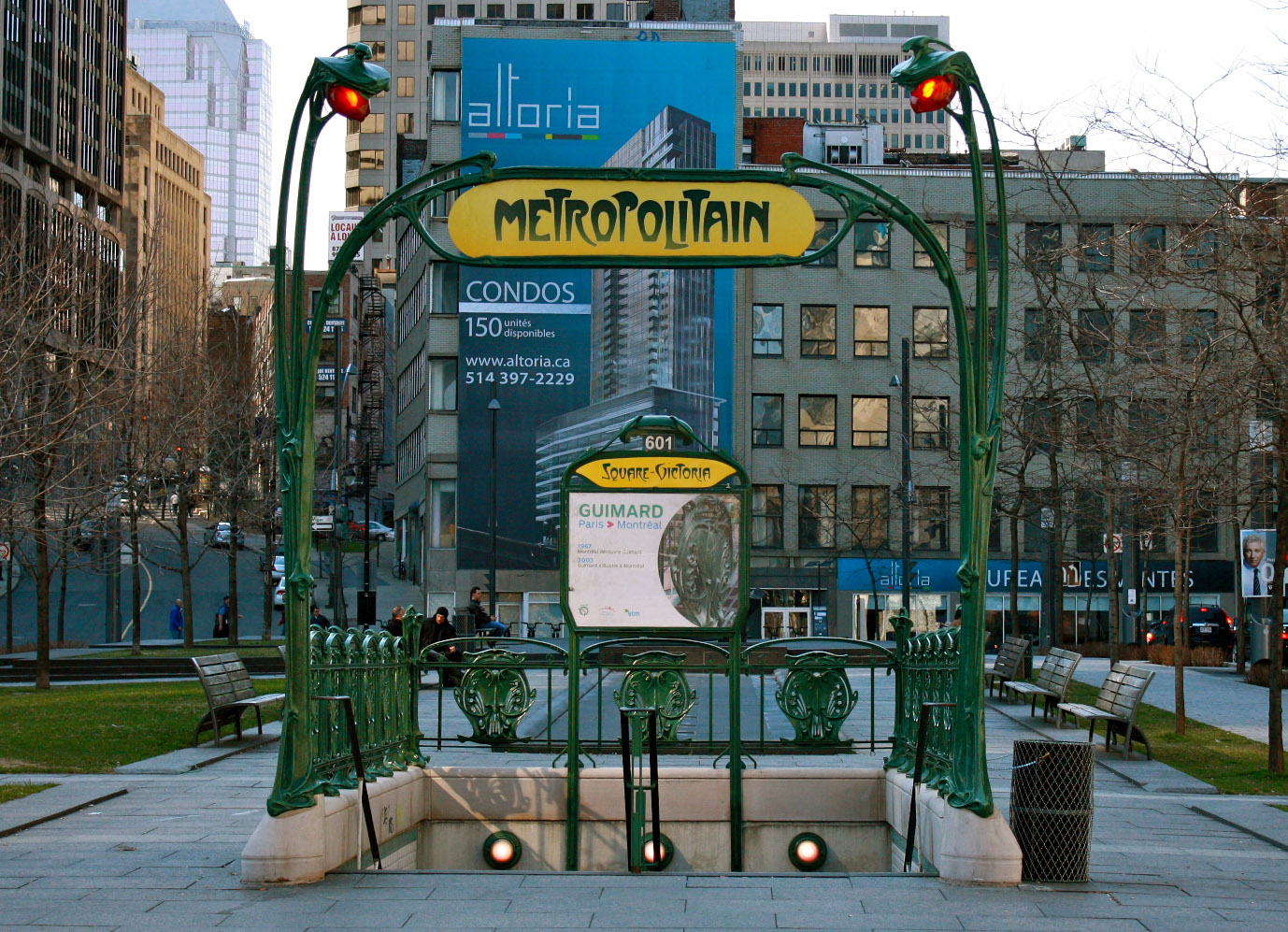
7. Métropolitain

No list of iconic logos would be complete without Hector Guimard’s Métropolitain.
Or…would it? Technically, Guimard’s Métropolitain isn’t even a logo. Although it wasn’t intended as such, Guimard’s wordmark became synonymous with the Parisian underground system, and is still about as close to a decent logo that the Paris Métro has ever come.
Guimard was commissioned in 1905 to create the gateways for many stations along the new Paris Métro, with the intention of making this new method of transportation more appealing to Parisians. The gates and logo were designed in the style of Art Nouveau, inspired by the natural flowing shapes of flowers and vines in the spirit of this new artistic movement.
Thanks very much to Daniel Wright, our friend and writer over on the brilliant blog, The Beauty of Transport, who suggested Guimard’s Métropolitain for this list.
6. Canadian National Railways

The second Canadian logo to appear in our top 10, the delightful Canadian National Railways logo was unveiled in 1960 and – you guessed it – was designed by Allan Fleming at Valkus.
Valkus, of course, would later go on to design the new identity for GO Transit, which appears at number 8 in our top 10.
In 1959, a revitalised and newly-confident CN surveyed Canadian’s attitudes to see how it measured up in the public mind. Shock, horror. When people thought of CN, they pictured an ‘old-fashioned’, ‘backward’ company, hostile to innovation – cue a massive rebranding excercise, with a new logo and identity at the very core of the initiative.
Incredibly, almost 60 years later, this logo is still in use today – a true testament to its versatility, likability and timelessness.
Thanks to Sam Swaffield for the suggestion on Twitter.
5. Trent Barton
@transportdsn This is completely biased, but this simple and elegant design provides unity amongst so many brands. Does everything a logo should. pic.twitter.com/hchIK1UNAo
— Matt King (@gnikttam) October 30, 2016
The subject of our very first article on Transport Designed (see ‘Trent Barton: a lesson in brand management‘ if you’d like to indulge in a slice of our history), Trent Barton’s ‘ribbon’ received a radical evolution in 2012 when it became the ‘bow’.
Designed by Best Impressions, the new logo aimed to unite Trent Barton’s many colourful brands under one signature banner, whilst ridding them of the ‘squiggle’ and better reinforcing the values which the company stood for. The spirit of Robin Hood continues to live on in the collection of neatly arranged circles, with signature ‘trent’ red forming the hollowed out ‘o’ at the heart of the bow.
Alex Hornby, now CEO at Transdev Blazefield, was Commercial Director at the time and oversaw the design of the new logo. Reflecting on the process, he said, “we wanted something based around the ‘o’ that would combine the colours of our brands. The theme had to be circles, a nod to the circle at the rear of each livery. And it had to be a natural evolution of the ribbon, but be much more versatile as a device”.
4. NS
@transportdsn The BR double arrow and it’s Dutch relative @NS_online are up there. pic.twitter.com/mL6qVWHpxh
— Darran Gange (@darrangange) October 30, 2016
The 1960s were a golden era for corporate identity in transport, with many of the entries in this list able to trace their roots back to this period in history. Not many of these logos are still in use today in their original form, however.
One exception is the NS (Dutch Railways) logo. Designed in 1968 by Gert Dumbar, who would soon after go on to found Dutch design house, Studio Dumbar, the logo drew heavy inspiration from its British contemporary, the double arrows. Still in use today, it can be found in spades on NS locomotives and rolling stock, at stations, online and across printed publicity.
3. Speedbird
Suggested by lots of our followers on Twitter including Plans Bloke, the Speedbird takes us into the top three of our list of iconic logos – and rightly so.
The Speedbird is a masterpiece. Designed in the stylised emblem of a bird in flight, it was created in 1932 by Theyre Lee-Elliot as the corporate logo for Imperial Airways.
The Speedbird became an instant classic, a powerfully emotional and romantic symbol of the jet-age. It went on to be used by Imperial’s successors – British Overseas Airways Corporation (BOAC) and British Airways – for over 50 years. Initially used on advertising posters and luggage labels, it was later applied to the nose section on the aircraft themselves – and even found its way onto the London Underground at Hatton Cross tube station.
The term ‘Speedbird’ is still the call sign for British Airways, even to this day.
2. British Rail
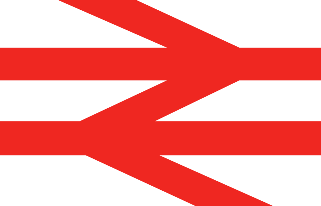
Whether you love it or hate it, British Rail’s universally recognisable double arrows is a work of modernist art, and only narrowly misses out on taking our top spot.
In 1964, Gerry Barney, of Design Research Unit, created what would become one of the nation’s most widely-used symbols on the back of an envelope whilst travelling on the Tube.
Design Research Unit had been commissioned by British Railways to breath new life into a disjointed, decrepit and vastly outdated British transport system. Out went the name, shortened to British Rail. Out went the crest, which harked back to the days of steam and were at odds with the modern image BR wanted to project. Along with the other elements of the rebrand, including a logotype, the Rail Alphabet typeface and the house colours, the double arrows signalled a new era, new thinking and new beliefs.
British Rail’s logo has outlasted British Rail itself, and can still be found across the length and breadth of the UK as the symbol for stations on the network.
Suggested by too many of our friends and followers to name all, but thanks to Darran Gange, Maggie and Tim Dunn for throwing the British Rail double arrows into the mix.
1. The Roundel
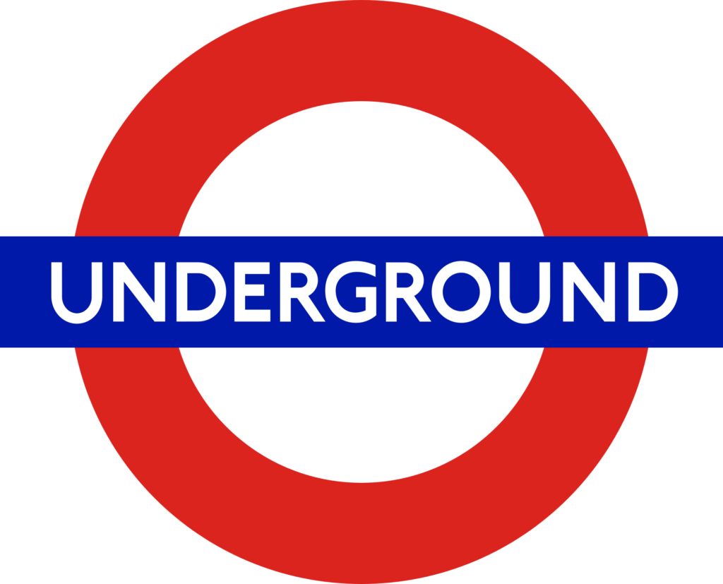
The Roundel is, quite simply, one of the worlds’ most recognisable symbols.
The Roundel has a long, complex and distinguished history. The earliest versions of its ancestors began to appear on the Tube around 1908. The first iteration of the Roundel comprised of a solid red disc with a horizontal blue bar, which began appearing on platforms to help passengers to separate the names of the stations from the mass of surrounding advertising hoardings.
The disc became a hollowed red ring with solid blue bar in 1917, when it was registered as a trademark for the first time, and began to appear in posters and publicity material. Johnston’s standard ring and bar, which is the earliest version of the Roundel as we know it today, along with his newly-created font for the Underground were first printed on map and timetable covers in 1919.
Transport for London still uses the Roundel to this day, and for good reason. It’s versatility and range of application is matched by nothing else. The Roundel of today appears in many different colours, across every mode of transport thinkable, across every type of media you can name, but loses none of its recognisability, meaning or trustworthiness.
Personally, it was a real wrench choosing between the double arrows and the Roundel for the top spot.
The double arrows are probably our favourite logo of all time. For the reasons listed above, however, there can only be one winner.
But what if there was a way, somehow, for both of these iconic logos to exist together in perfect harmony? Wouldn’t that be a thing of beauty?
Fear not – for such a glorious place exists!
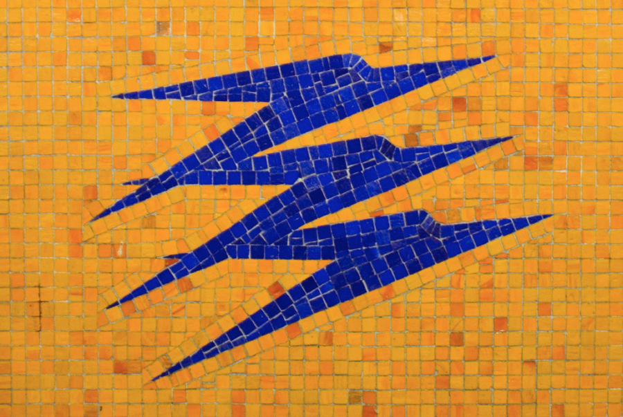
This stunning mosaic at King’s Cross station celebrates the coming together of the British Rail network and the Tube in one location.
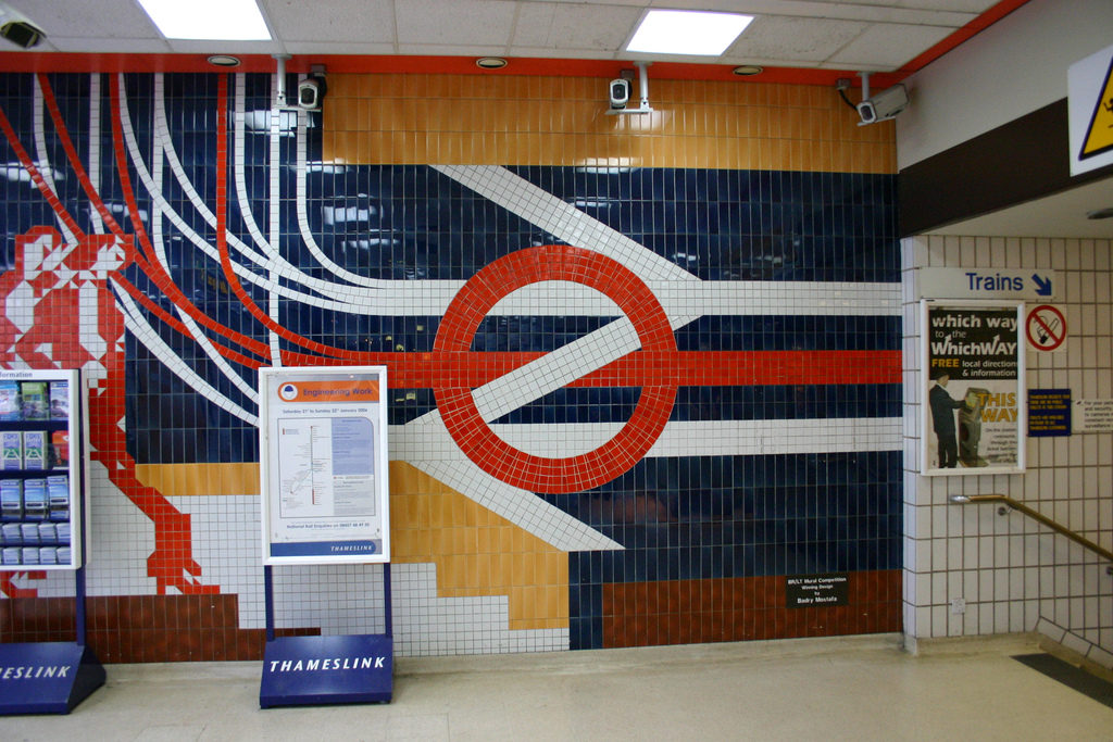
What do you think? Do you agree with our list? What would have taken the top spot if you were putting this list together? Write in the comments below, or tweet us @transportdsn.

