
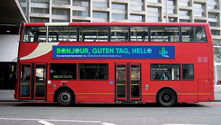
Bonjour, guten tag, hello! A new brand has landed for London City Airport.
London City Airport have unveiled their bright, colourful new look, masterminded by London-based creative agency, The Allotment.
The bold, disruptive, vibrant and contemporary new look combines bags of personality with a more dynamic feel, synonymous with that of modern London. The transformed design, which utilises vivid colours, creative layout, and a heart motif, reinforces London City’s role as London’s most central airport.
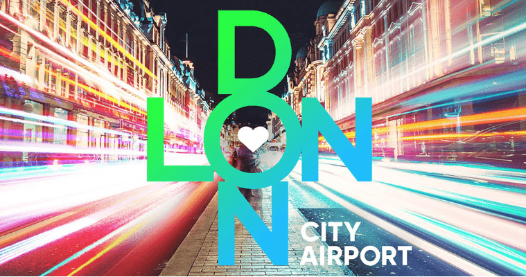
The use of the vivid blue colour in the logo represents London City’s location in the heart of the Royal Docks, whilst the contrasting green symbolises the capital’s many parks and green spaces.
As well as its vivid colour palette, the design uses a modified Gilroy typeface, in what is both a modern interpretation of London’s iconic typography and an accessible, familiar design for international travellers.
London City’s digital assets, including their website and social media, have already been transformed, with signage and a print advertising campaign to come next.
What do you think about the new look for London City Airport?
Let us know in the comments below, or tweet @transportdsn.